Creating Animated NDVI Maps of Pakistan
Introduction
In this post, I will guide you through the process of creating animated NDVI (Normalized Difference Vegetation Index) maps for Pakistan using R. The animation will showcase seasonal vegetation variations across the country, utilizing data from the previous post on downloading NDVI data via Google Earth Engine. We will employ various R packages, including ggplot2, to generate visually appealing and informative animations.
Required Libraries
First, load the necessary libraries. These include packages for handling spatial data, creating animations, and visualizing the results.
library(tidyverse)
library(sf)
library(terra)
library(RColorBrewer)
library(magick)
Data Loading
Next, we’ll load the boundary shapefiles of Pakistan at two administrative levels: the country level (ADM0) and the provincial level (ADM1). These boundaries will help us delineate different regions within the country, making the animated maps more informative.
Load Country Boundary Lines
# Load boundary shapefiles
pak0 <- st_read("../data/shapefiles/pak_admbnda_adm0_wfp_20220909.shp")
## Reading layer `pak_admbnda_adm0_wfp_20220909' from data source
## `/Users/muhammadmohsinraza/Downloads/DataWim/content/post/data/shapefiles/pak_admbnda_adm0_wfp_20220909.shp'
## using driver `ESRI Shapefile'
## Simple feature collection with 1 feature and 10 fields
## Geometry type: MULTIPOLYGON
## Dimension: XY
## Bounding box: xmin: 60.8786 ymin: 23.69468 xmax: 77.83397 ymax: 37.08942
## Geodetic CRS: WGS 84pak1 <- st_read("../data/shapefiles/pak_admbnda_adm1_wfp_20220909.shp")## Reading layer `pak_admbnda_adm1_wfp_20220909' from data source
## `/Users/muhammadmohsinraza/Downloads/DataWim/content/post/data/shapefiles/pak_admbnda_adm1_wfp_20220909.shp'
## using driver `ESRI Shapefile'
## Simple feature collection with 7 features and 12 fields
## Geometry type: MULTIPOLYGON
## Dimension: XY
## Bounding box: xmin: 60.8786 ymin: 23.69468 xmax: 77.83397 ymax: 37.08942
## Geodetic CRS: WGS 84# Plot the boundary lines
plot(st_geometry(pak0))
plot(st_geometry(pak1), add = TRUE)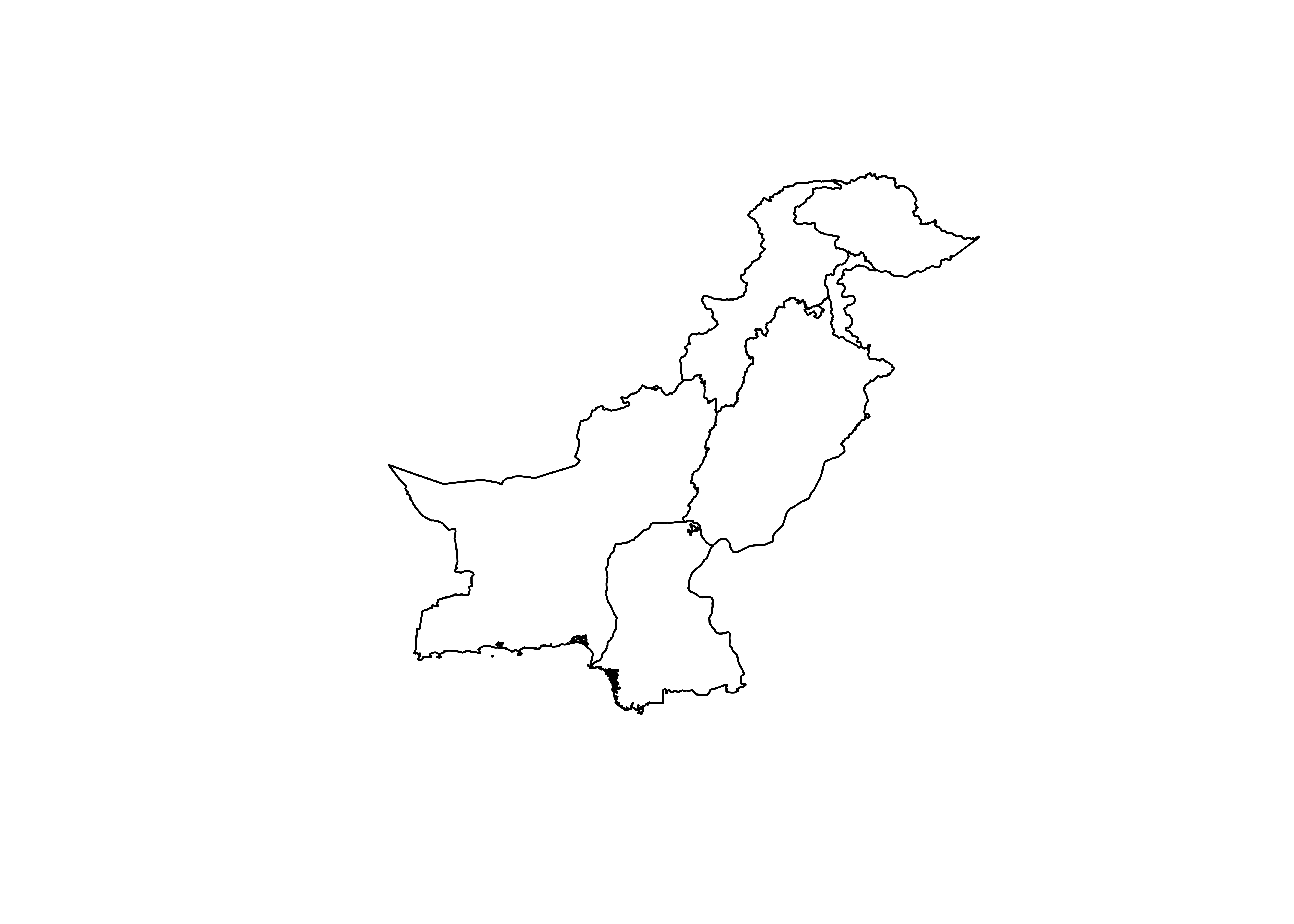
NDVI Data Processing
We’ll proceed by loading the processed monthly mean NDVI data, reprojecting it to match the coordinate reference system of our boundary shapefiles, and standardizing the NDVI values.
Load Monthly Mean NDVI Data
ndvi <- rast("../data/remote_sensing/Pakistan_Monthly_NDVI_2023.tif")
ndvi <- terra::project(ndvi, crs(pak0))
## |---------|---------|---------|---------|========================================= # Standardize the NDVI data
ndvi <- ndvi / 10000## |---------|---------|---------|---------|========================================= # Plot the monthly mean NDVI bands
plot(ndvi)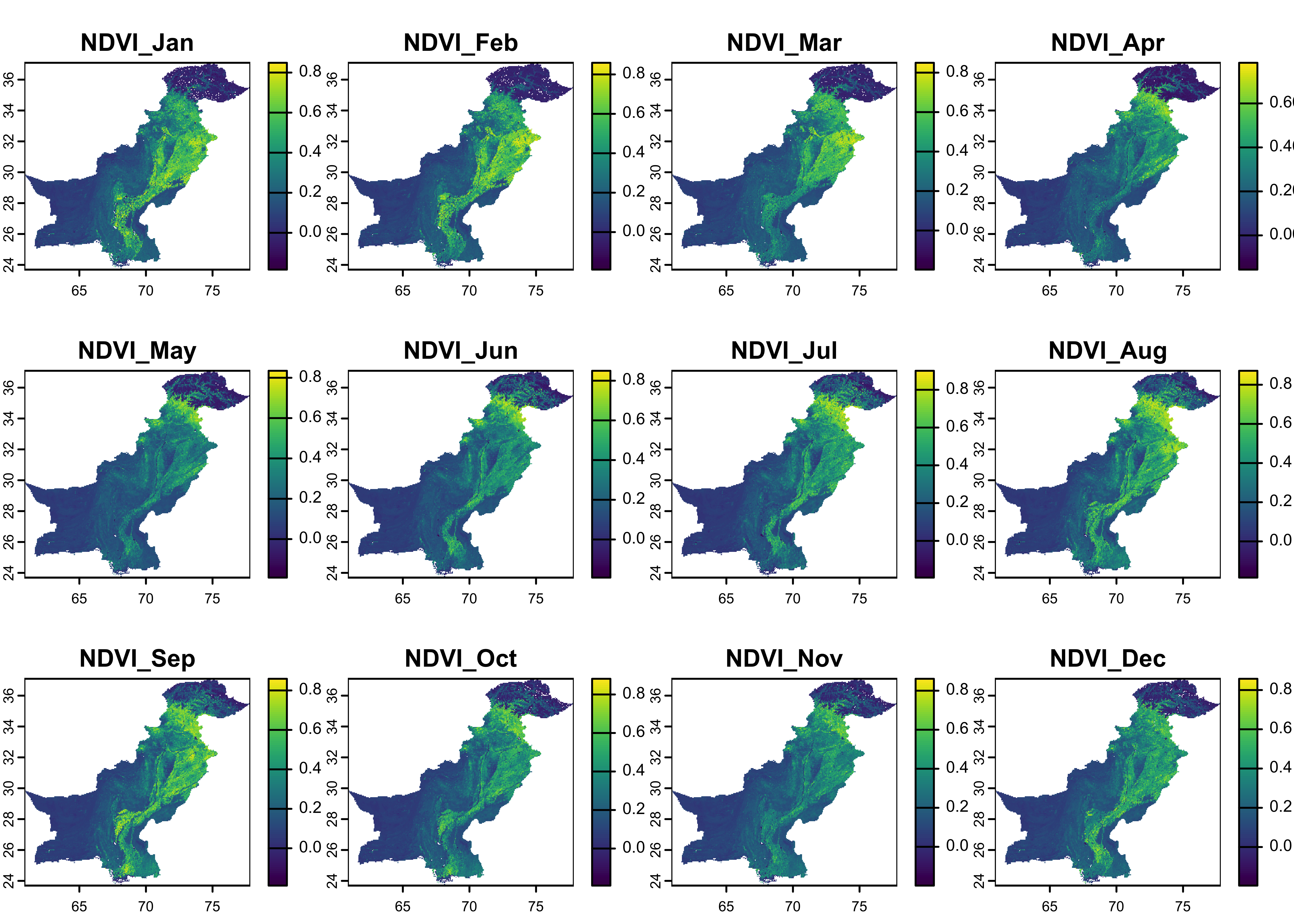
NDVI Color Palette
To enhance the visualization, we will define a custom NDVI color palette. This palette is adapted from Google Earth Engine’s default NDVI visualization.
Define the NDVI Color Palette
# Define the NDVI color palette
ndvi_palette <- c("#ffffff", "#ce7e45", "#df923d", "#f1b555", "#fcd163", "#99b718", "#74a901",
                  "#66a000", "#529400", "#3e8601", "#207401", "#056201", "#004c00", "#023b01",
                  "#012e01", "#011d01", "#011301")

# Rescale function for color mapping
rescale_values <- function(x, min, max) {
  (x - min) / (max - min)
}
Pipeline Setup for Testing
Before proceeding with the full animation, let’s test our setup by plotting a single month’s NDVI data. This step ensures that our data and color palette are functioning as expected.
Test Pipeline with One Month’s Data
TT <- ndvi[[1]] |>
  as.data.frame(xy = TRUE) |>
  pivot_longer(cols = !c(x, y)) |>
  filter(value != 0)

pp <- TT |>
  ggplot() +
  geom_tile(aes(x = x, y = y, fill = value)) +
  scale_fill_gradientn(
    colors = ndvi_palette,
    space = "Lab"
  ) +
  geom_sf(data = pak1, fill = NA, color = "black", lwd = 0.75) +
  facet_wrap(~name)

pp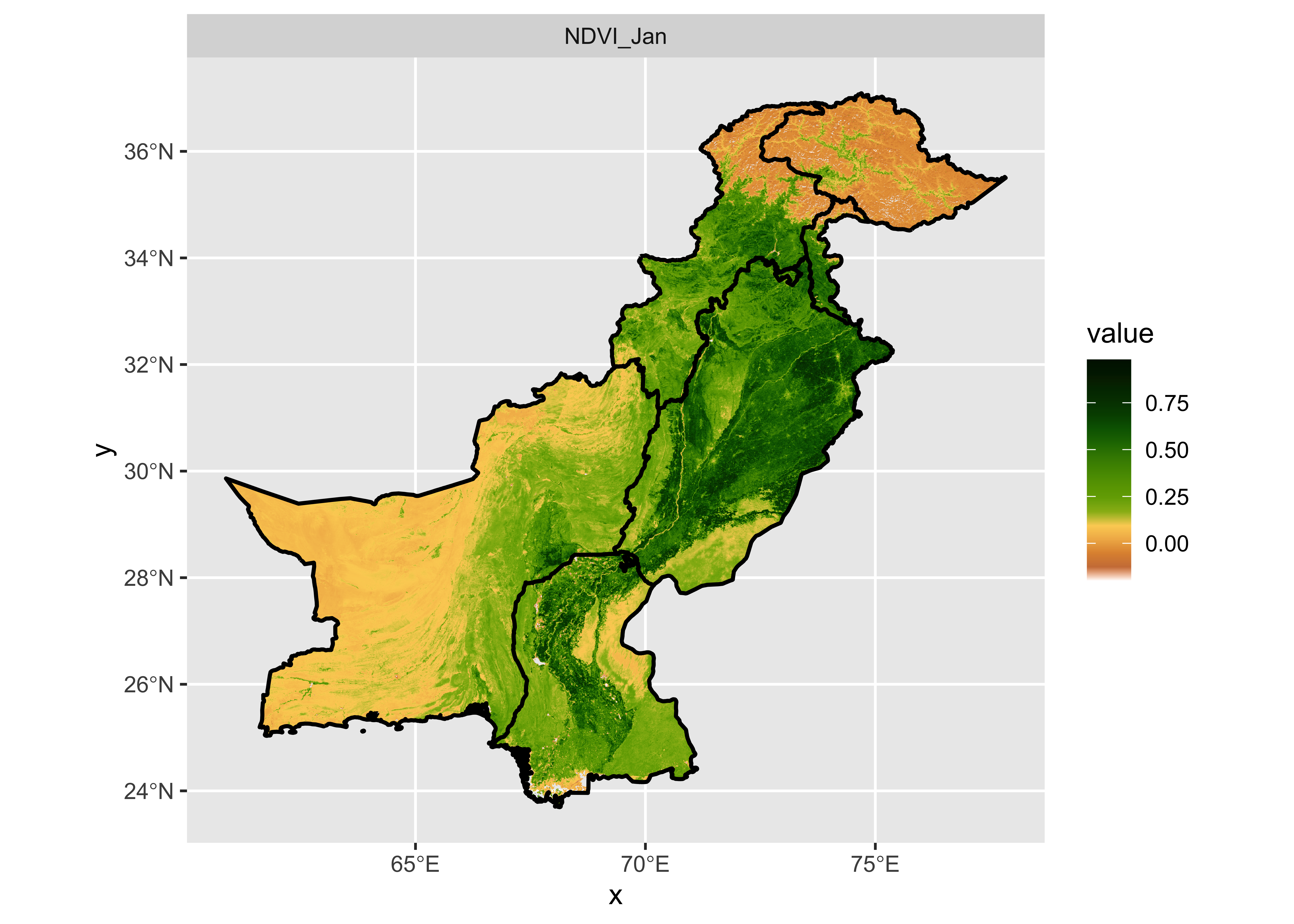
Animation Preparation
With the test successful, we can now prepare for the full animation. We’ll start by creating an output directory to store the individual frames and set up the file names accordingly.
Setup for Animation
# Define output directory and animation file name
output_dir <- "Figures"
animation_file <- "ndvi_animation.gif"
Next, we’ll rename the NDVI bands to correspond to their respective months. This will ensure that the correct month name appears in the animation.
Rename NDVI Bands
names(ndvi) <- c("January", "February", "March", "April", "May", "June", "July", "August", "September", "October", "November", "December")Generate NDVI Maps for Each Month
We’ll now generate an NDVI map for each month and save it as a PNG file in the specified directory.
Create Monthly NDVI Maps
# Create the output directory if it doesn't exist
if (!dir.exists(output_dir)) {
dir.create(output_dir)
}
# Convert NDVI stack to dataframe and filter non-NA values
g_df <- as.data.frame(ndvi, xy = TRUE) %>%
pivot_longer(cols = !c(x, y), names_to = "Month", values_to = "ndvi") %>%
filter(!is.na(ndvi))
# Get unique months
Months <- unique(g_df$Month)
# Generate and save NDVI maps for each month
purrr::map(Months, ~{
month_data <- g_df %>%
filter(Month == .x)
world_map <- ggplot() +
theme_void(base_size = 14) +
xlim(60.8786, 77.83397) +
ylim(23.69468, 37.08942) +
geom_raster(data = month_data, aes(x = x, y = y, fill = ndvi, group = Month), color = NA) +
scale_fill_gradientn(colors = ndvi_palette, space = "Lab") +
guides(fill = guide_legend(reverse = TRUE)) +
geom_sf(data = pak0, fill = NA, color = "black", linewidth = 0.8) +
geom_sf(data = pak1, fill = NA, color = "black", linewidth = 0.75) +
theme(panel.background = element_rect(fill = "white")) +
theme(legend.position = "none") +
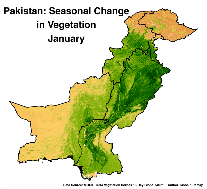
annotate("text", x = 66, y = 34.5, label = paste("Pakistan: Seasonal Change", "in Vegetation", .x, sep = "\n"), size = 9,
color = "black", hjust = 0.5, vjust = 0, fontface = "bold") +
annotate("text", x = 69.5, y = 23.70, label = "Data Source: MODIS Terra Vegetation Indices 16-Day Global 500m Author: Mohsin Ramay", size = 3,
color = "black", hjust = 0.3, vjust = 2.5, fontface = "bold")
file_path <- file.path(output_dir, sprintf("ndvi_%s.png", .x))
ggsave(file_path, world_map, dpi = 400, width = 7.65, height = 7)
cat(paste("Generated:", file_path, "\n"))
})## Generated: Figures/ndvi_January.png## Generated: Figures/ndvi_February.png## Generated: Figures/ndvi_March.png## Generated: Figures/ndvi_April.png## Generated: Figures/ndvi_May.png## Generated: Figures/ndvi_June.png## Generated: Figures/ndvi_July.png## Generated: Figures/ndvi_August.png## Generated: Figures/ndvi_September.png## Generated: Figures/ndvi_October.png## Generated: Figures/ndvi_November.png## Generated: Figures/ndvi_December.png## [[1]]
## NULL
##
## [[2]]
## NULL
##
## [[3]]
## NULL
##
## [[4]]
## NULL
##
## [[5]]
## NULL
##
## [[6]]
## NULL
##
## [[7]]
## NULL
##
## [[8]]
## NULL
##
## [[9]]
## NULL
##
## [[10]]
## NULL
##
## [[11]]
## NULL
##
## [[12]]
## NULLCreate the Animation
Finally, we will compile the individual PNG images into an animated GIF using the magick package.
Generate the Animation
# List PNG files in the output directory
image_files <- list.files(output_dir, pattern = "*.png", full.names = TRUE)

# Ensure images are ordered by month
month_order <- c("January", "February", "March", "April", "May", "June",
                 "July", "August", "September", "October", "November", "December")
month_names <- gsub(".*ndvi_(\\w+)\\.png", "\\1", image_files)
month_numeric <- match(month_names, month_order)
sorted_image_files <- image_files[order(month_numeric)]

# Read and resize images
images <- lapply(sorted_image_files, function(img) {
  image_read(img) %>%
    image_resize("2000x1800")  # Adjust dimensions as needed
})

# Set frames per second (fps)
fps <- 2.5

# Create the animation
animation <- image_animate(image_join(images), fps = fps)
animation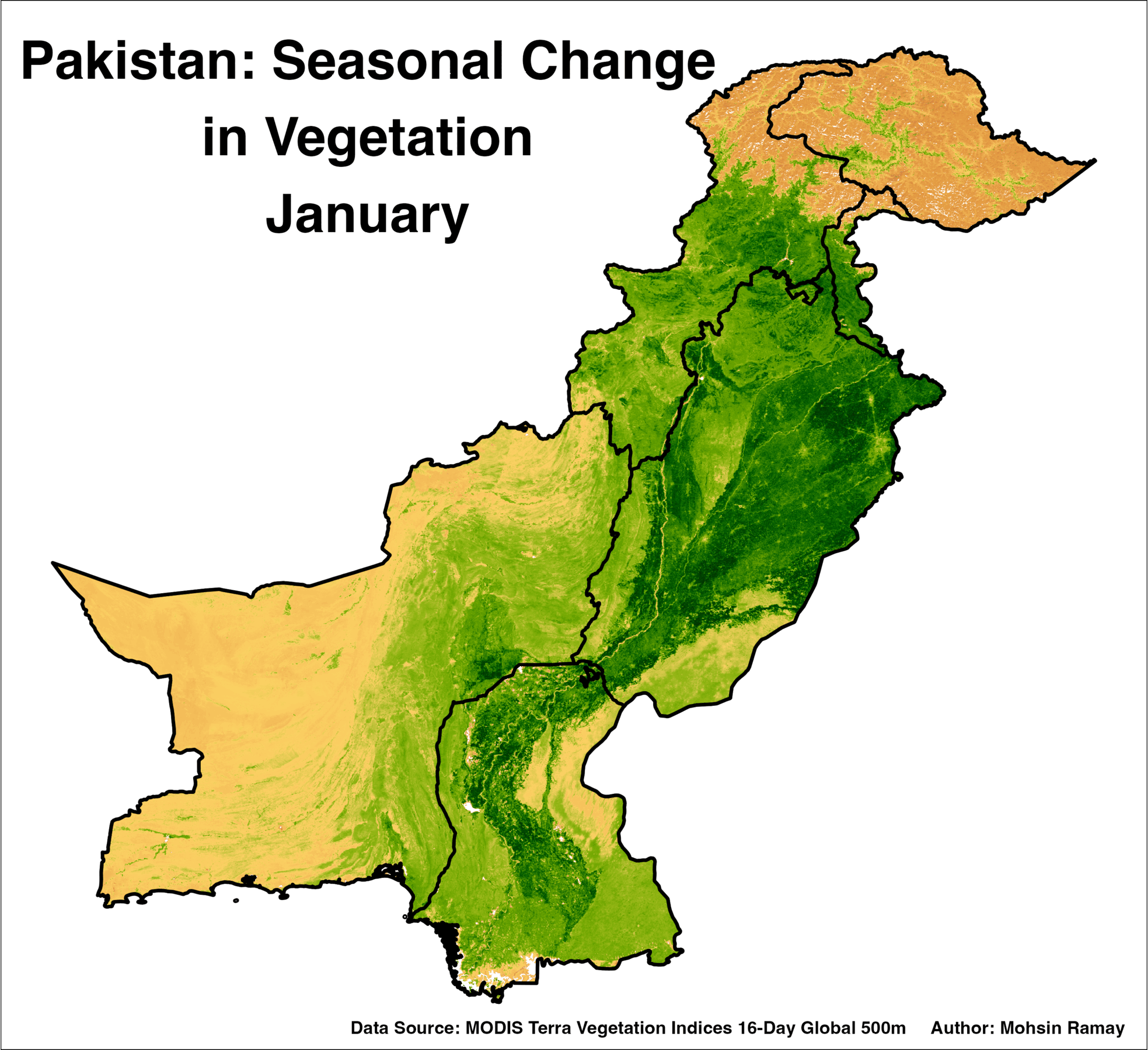
Save the Animation
# Save the animation as a GIF file
image_write(animation, animation_file)
Conclusion
This post demonstrated how to create an animated NDVI map of Pakistan, highlighting the seasonal changes in vegetation across the country. By leveraging R’s powerful data manipulation and visualization libraries, we created a comprehensive and visually appealing animation that can be used for further analysis or presentations.
That’s it!
Feel free to reach me out if you got any questions.
Muhammad Mohsin Raza
Data Scientist
My research interests include disease modeling in space and time, climate change, GIS and Remote Sensing and Data Science in Agriculture.