Creating Professional Bivariate Maps in R
Bivariate maps are a powerful tool in geospatial analysis that simultaneously visualize the relationship between two variables across a geographical area. Unlike univariate maps that display only one variable, bivariate maps offer a more nuanced representation by allowing for the analysis of correlations and co-occurrences in spatial data. This is especially valuable in understanding complex geographical phenomena, such as the relationship between temperature and precipitation patterns, which can provide insights into climate change, agricultural planning, and environmental management.
In this post, I will demonstrate how to create professional bivariate maps in R using the ggplot2 package. We will use long-term temperature and precipitation data from the United Kingdom to showcase this approach.
Required Libraries
Before we begin, we need to load several libraries:
- tidyverse: Provides a collection of packages for data manipulation and visualization.
- sf: Facilitates working with spatial data and integrates well with the tidyverse.
- terra: Handles raster data operations, such as downloading and processing climate data.
- rgeoboundaries: Provides convenient access to country boundaries, simplifying the process of geographic data retrieval.
- climateR: Allows easy access to climate data, which we will use to obtain historical temperature and precipitation records.
- biscale: Used for bivariate classification of data, which is essential for creating bivariate maps.
Loading these libraries will set the foundation for data retrieval, processing, and visualization.
# Load libraries
library(tidyverse)
library(sf)
library(terra)
library(rgeoboundaries)
library(climateR)
library(biscale)
Loading Data
In this example, we will use the United Kingdom as the study area. We will retrieve boundary data for two administrative levels using the rgeoboundaries package. This package is highly convenient for downloading country boundary data, saving significant time and effort in data preparation.
Boundary Data
# Load United Kingdom boundary data at the country level (administrative level 0)
uk0 <- geoboundaries(country = c("United Kingdom"))

# Load United Kingdom boundary data at the first administrative level (e.g., regions)
uk1 <- geoboundaries(country = c("United Kingdom"), adm_lvl = "adm1")

# Plot the geometry of administrative level 1 boundaries with a gray border
plot(st_geometry(uk1), border = "gray")

# Add the country boundary (administrative level 0) to the existing plot in bold
plot(st_geometry(uk0), add = TRUE, size = 2)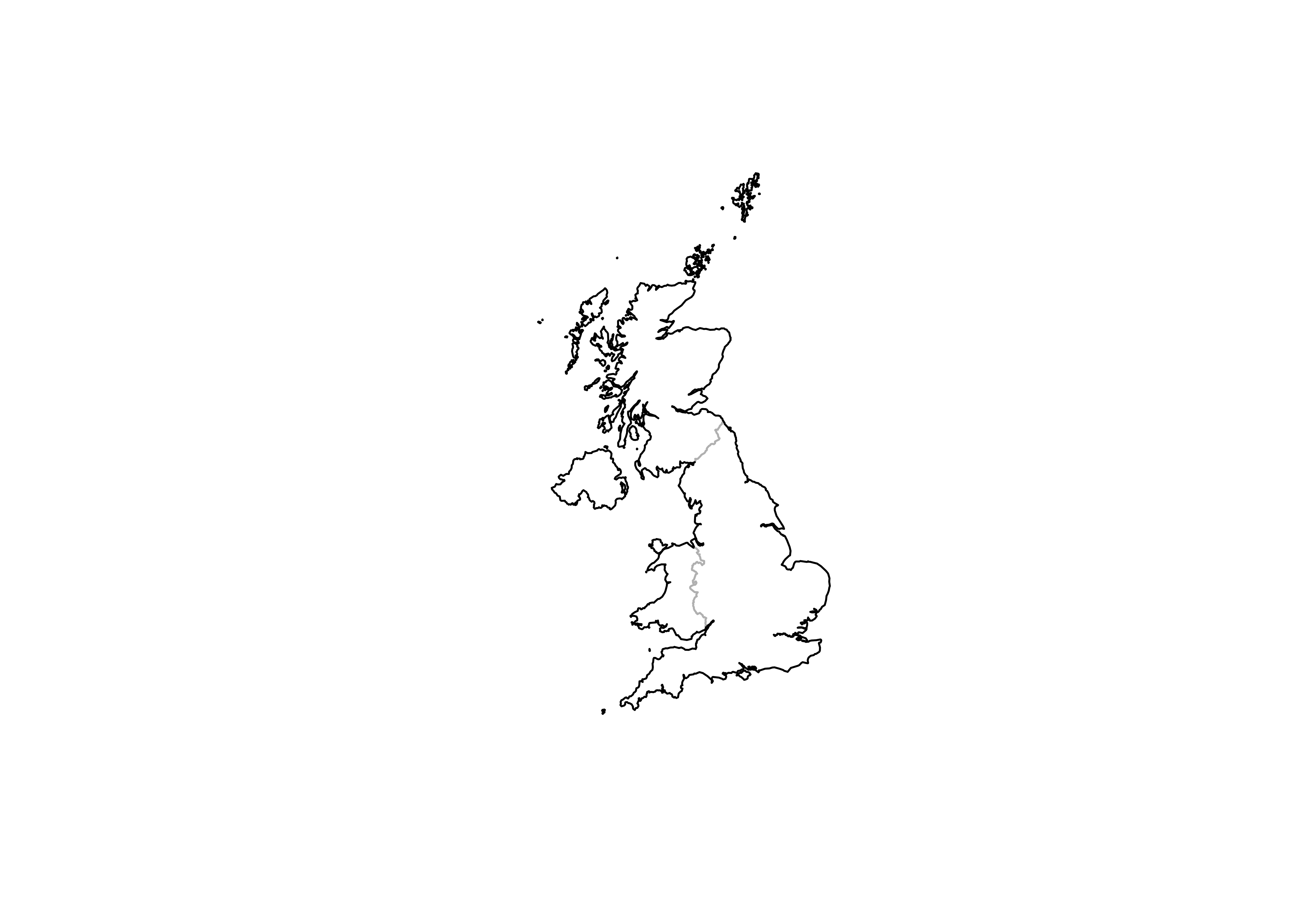
For climate data, we will use the getTerraClim function from the climateR package, which provides historical climate data at a monthly temporal resolution for a variety of variables. In this post, we will focus on minimum and maximum temperature, and precipitation.
Temperature Data
First, let’s load the temperature data (minimum and maximum). We will download data for the past 50 years (1973-2023) and aggregate it to calculate the mean annual temperature.
# Retrieve TerraClimate data for the United Kingdom with specified variables (max and min temperature)
temp_terra = getTerraClim(AOI = uk0,
                          varname = c("tmax", "tmin"),
                          startDate = "1973-01-01",
                          endDate  = "2023-12-01")

# Calculate the monthly mean temperature by averaging maximum and minimum temperature
mean_temp_monthly <- (temp_terra$tmax + temp_terra$tmin) / 2
## |---------|---------|---------|---------|========================================= |---------|---------|---------|---------|========================================= # Calculate the annual mean temperature by averaging the monthly means across all months
annual_mean_temp <- mean(mean_temp_monthly, na.rm = TRUE)
# Plot the annual mean temperature
plot(annual_mean_temp)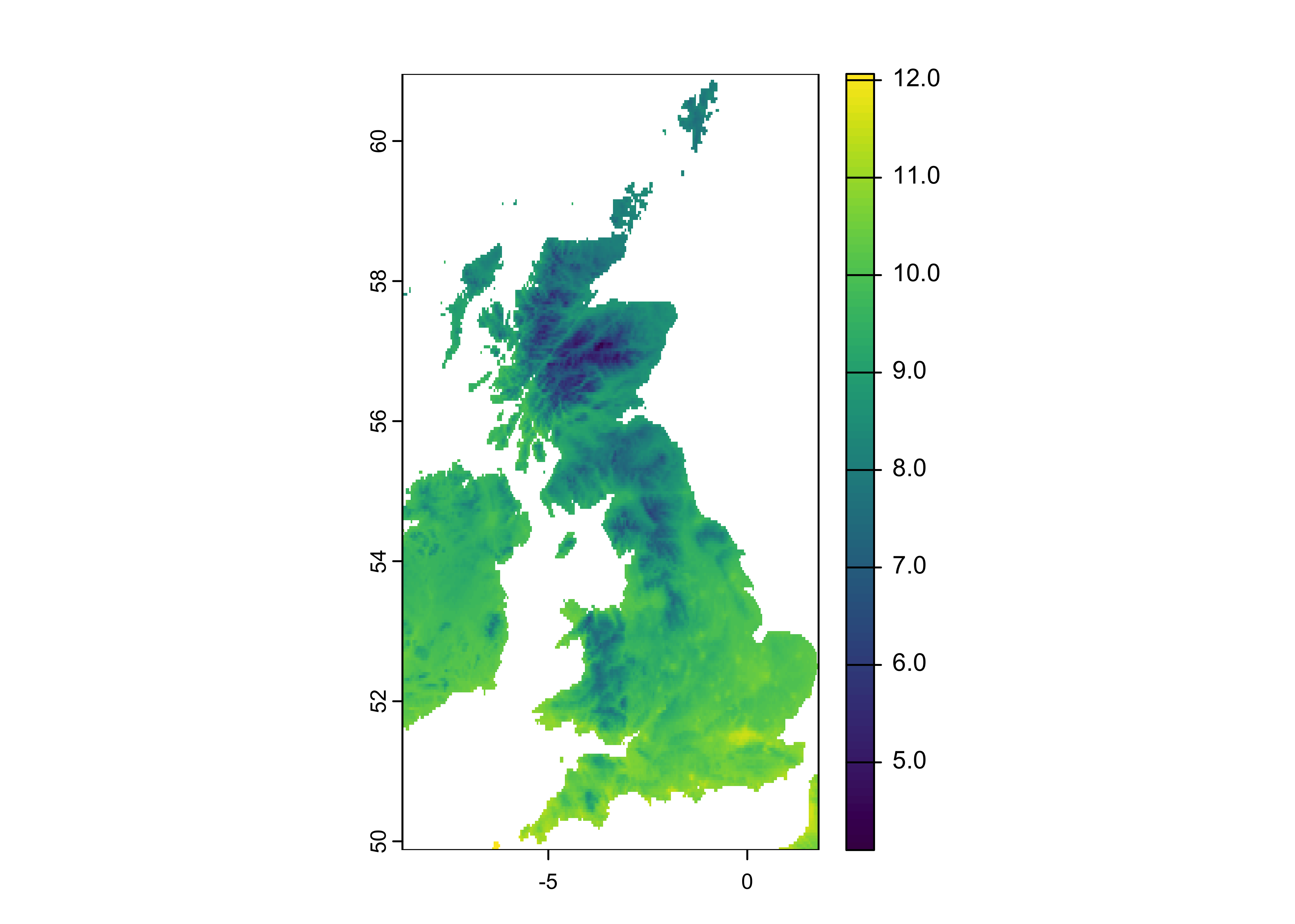
# Resample the annual mean temperature raster to a finer resolution (approximately 1 km)
new_res <- 0.025  # Set the new resolution
new_raster <- rast(ext(annual_mean_temp), resolution = new_res, crs = crs(annual_mean_temp))
annual_mean_temp <- resample(x = annual_mean_temp, y = new_raster, method="bilinear")

# Crop the resampled temperature data to match the boundaries of the United Kingdom
uk_temp <- terra::crop(annual_mean_temp, y = uk0, mask = TRUE)

# Plot the cropped annual mean temperature for the United Kingdom
plot(uk_temp)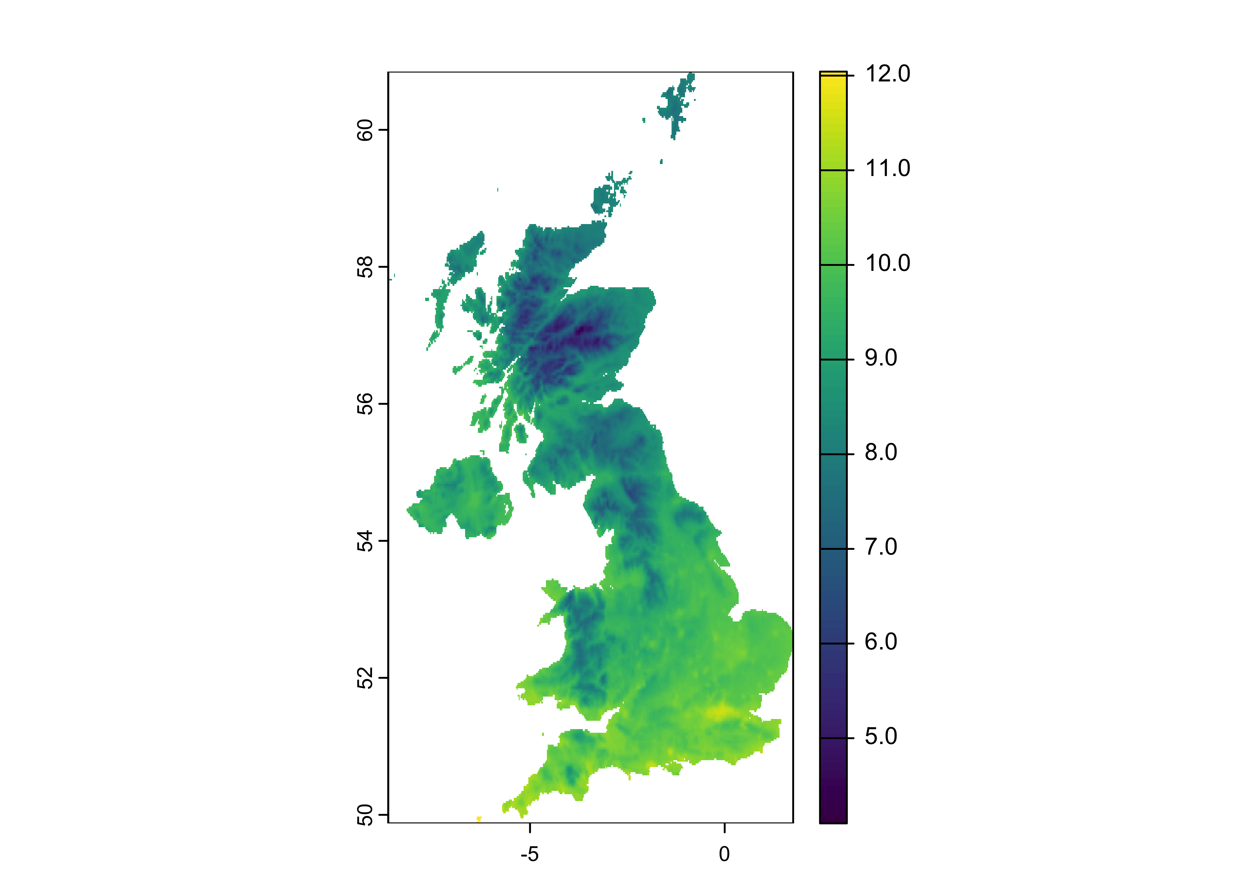
Precipitation Data
Similarly, let’s load and process the precipitation data to ensure it aligns with the temperature data in terms of spatial resolution.
# Retrieve TerraClimate data for precipitation in the United Kingdom
ppt_terra = getTerraClim(AOI = uk0,
                         varname = "ppt",
                         startDate = "1973-01-01",
                         endDate  = "2023-12-01")

# Calculate the annual mean precipitation by averaging the monthly precipitation values across all months
annual_mean_ppt <- mean(ppt_terra$ppt, na.rm = TRUE)

# Resample the annual mean precipitation raster to a finer resolution (approximately 1 km)
new_raster <- rast(ext(annual_mean_ppt), resolution = new_res, crs = crs(annual_mean_ppt))
annual_mean_ppt <- resample(x = annual_mean_ppt, y = new_raster, method = "bilinear")

# Crop the resampled precipitation data to match the boundaries of the United Kingdom
uk_ppt <- terra::crop(annual_mean_ppt, y = uk0, mask = TRUE)

# Plot the cropped annual mean precipitation for the United Kingdom
plot(uk_ppt)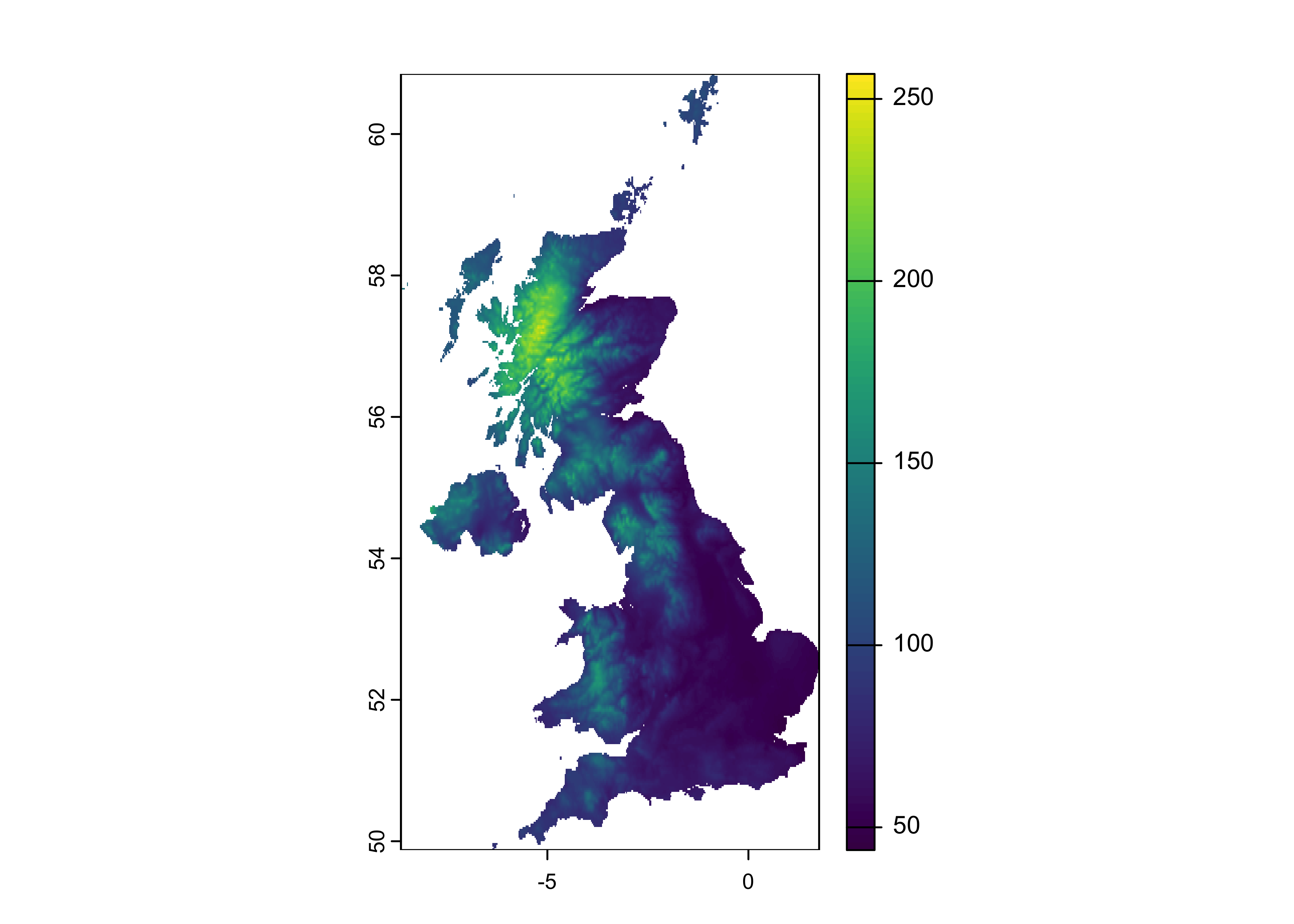
Data Processing
Stacking Rasters
After calculating the mean temperature and precipitation, we need to stack both rasters into a single raster stack. This allows us to work with both datasets together, facilitating the creation of a bivariate map.
# Combine temperature and precipitation rasters into a single raster stack
temp_ppt <- c(uk_temp, uk_ppt)

# Assign descriptive names to each raster layer in the stack
names(temp_ppt) <- c("temp", "ppt")
Converting to DataFrame
Next, we convert the raster data to a data frame while retaining the x and y coordinates for visualization.
# Project the combined temperature and precipitation raster stack to match the projection of the UK boundary
# Then convert the raster data to a data frame, retaining the x and y coordinates for mapping
temp_ppt_df <- temp_ppt |>
  project(uk0) |>
  as.data.frame(xy = TRUE)

# Display the first few rows of the resulting data frame to verify the data
head(temp_ppt_df)
## x y temp ppt
## 310 -0.9041685 60.8375 8.129262 105.7505
## 311 -0.8791685 60.8375 8.109694 105.6284
## 312 -0.8541685 60.8375 8.078681 105.5221
## 725 -0.9291685 60.8125 8.113284 106.2017
## 726 -0.9041685 60.8125 8.098499 106.0178
## 727 -0.8791685 60.8125 8.029757 107.0782Bivariate Mapping
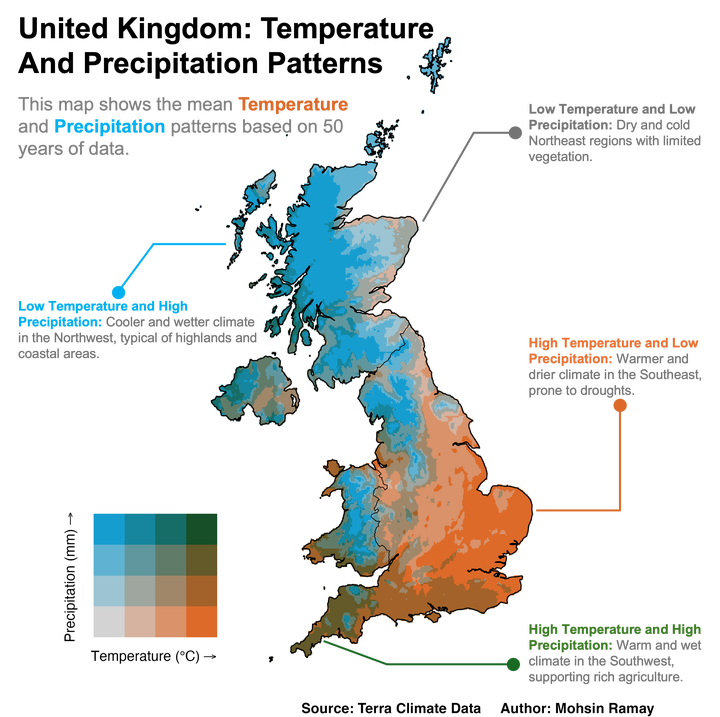
To create a bivariate map, we need to classify both temperature and precipitation data into categories. We will use the bi_class function from the biscale package. The classification method used here is quantile, which ensures an even distribution of data into the specified number of classes. We will use four classes, resulting in a total of 16 bivariate categories.
Bi Class Analysis
# Classify the temperature and precipitation data into bivariate classes using the 'biscale' package
# 'style = "quantile"' divides data into quantiles, and 'dim = 4' creates 4 classes for each variable, resulting in 16 bivariate categories
data <- bi_class(temp_ppt_df,
                 x = temp,
                 y = ppt,
                 style = "quantile", dim = 4)

# Plot the distribution of the bivariate classes to visualize the frequency of each class
data |>
  count(bi_class) |>
  ggplot(aes(x = bi_class, y = n)) +
  geom_col() +  # Create a bar plot to show the count of each bivariate class
  labs(title = "Distribution of Bivariate Classes", x = "Bivariate Class", y = "Frequency")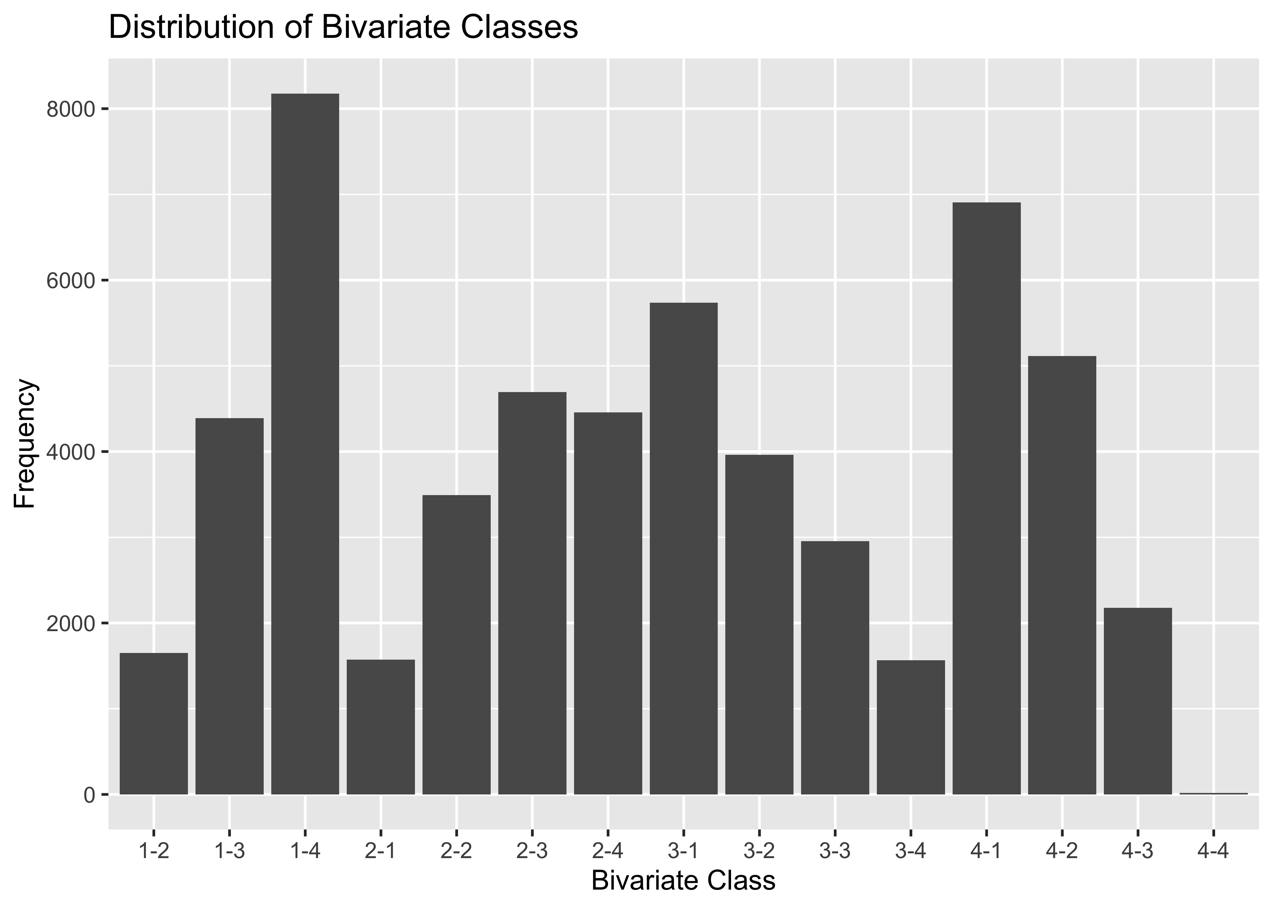
Mapping the Data
We will now create a bivariate map using ggplot2 to visualize the relationship between temperature and precipitation across the United Kingdom.
# Set the color palette for the bivariate map
pallet <- "BlueOr"
# Create the bivariate map using ggplot2
map <- ggplot() +
theme_void(base_size = 14) + # Set a minimal theme for the map
xlim(-8.645449, 1.754926) + # Set the x-axis limits for the map (longitude range)
ylim(49.88483, 60.84338) + # Set the y-axis limits for the map (latitude range)
# Plot the bivariate raster data with appropriate fill color based on bivariate classes
geom_raster(data = data, mapping = aes(x = x, y = y, fill = bi_class), color = NA, linewidth = 0.1, show.legend = FALSE) +
# Apply the bivariate color scale using the selected palette and dimensions
bi_scale_fill(pal = pallet, dim = 4, flip_axes = FALSE, rotate_pal = FALSE) +
# Overlay the first administrative level boundaries of the United Kingdom
geom_sf(data = uk1, fill = NA, color = "black", linewidth = 0.20) +
# Overlay the country-level boundary of the United Kingdom
geom_sf(data = uk0, fill = NA, color = "black", linewidth = 0.40) +
# Add labels for the map
labs(title = "United Kingdom: Temperature and Precipitation Patterns",
subtitle = "Mean temperature and precipitation patterns based on 50 years of data.",
caption = "Source: Terra Climate Data Author: Mohsin Ramay") +
# Customize the appearance of the title, subtitle, and caption
theme(plot.title = element_text(hjust = 0.5, face = "bold"),
plot.subtitle = element_text(hjust = 0.5),
plot.caption = element_text(size = 10, face = "bold", hjust = 7))
# Create the legend for the bivariate map
legend <- bi_legend(pal = pallet,
flip_axes = FALSE,
rotate_pal = FALSE,
dim = 4,
xlab = "Temperature (°C)",
ylab = "Precipitation (mm)",
size = 10)
# Combine the map and legend using cowplot
library(cowplot)
finalPlot <- ggdraw() +
draw_plot(map, 0, 0, 1, 1) + # Draw the main map plot
draw_plot(legend, 0.05, 0.05, 0.28, 0.28) # Draw the legend in the specified position
# Display the final map with legend
finalPlot
Saving the Map
To save the map with high quality, we use the ggsave function.
ggsave("UK_Temp_PPT.png", finalPlot, dpi = 400, width = 7, height = 7)Conclusion
Bivariate maps are an effective way to visualize the spatial relationship between two variables, providing richer insights than univariate maps. In this post, we demonstrated how to create a professional bivariate map in R using long-term temperature and precipitation data for the United Kingdom. By utilizing powerful R packages like ggplot2, biscale, and terra, we were able to process, classify, and visualize the relationship between these two climatic variables effectively.
This method can be extended to other geographic areas and variables, making it a versatile tool for spatial analysis in environmental sciences, agricultural planning, and climate studies. As we continue to face the challenges of climate change, using such advanced visualization techniques can help decision-makers understand and respond to complex environmental interactions more effectively.
Feel free to explore the code and adapt it to your own datasets and regions of interest to uncover new insights in your geospatial analysis projects.
That’s it!
Feel free to reach me out if you got any questions.
Muhammad Mohsin Raza
Data Scientist
My research interests include disease modeling in space and time, climate change, GIS and Remote Sensing and Data Science in Agriculture.