Modeling Change In Per Hectare Crop Yield Over Time
In this blog post, I’ll walk my readers through the R code I wrote in one of my Kaggle Notebooks to visualize the trends of different crop yields in most populated countries over time (years). Besides that, I’ll also visualize the population growth in the world and the populated countries. Initially, I have worked on a few countries in this notebook to optimally utilize the time. However, readers can use this code for the countries and crops of their choice. At the end, I’ll model and visualize the change in per hectare crop yield over time in the selected countries.
Load libraries
In this data visualization and analysis post, I’ll use the following R packages. I have labeled the category of each package as data science, modeling, visualization and tables.
# Data science
library(tidyverse)
library(janitor)
library(DataExplorer)
library(skimr)

# Modeling
library(tidymodels)

# Visualization
library(ggrepel)

# Tables
library(gt)
Upload data
In this blog post, I have used the data for crop production (yield) and population in countries provided on github. I used the read_csv function to remotely read the data from github.
crop <- read_csv("https://raw.githubusercontent.com/rfordatascience/tidytuesday/master/data/2020/2020-09-01/key_crop_yields.csv")

land <- read_csv("https://raw.githubusercontent.com/rfordatascience/tidytuesday/master/data/2020/2020-09-01/land_use_vs_yield_change_in_cereal_production.csv")
Exploratory data analysis
The first task of any data analysis and visualization project after data loading is the Exploratory Data Analysis or EDA. Exploratory data analysis helps analysts swiftly understanding the data structure and patterns in it.
Data structure
The first and foremost thing we do in EDA is understanding the data structure. Luckily, developers have built few packages such as skimr that can help us in quickly understanding the data structure. Here, I used the skim function of skimr package to see different attributes of the data.
- See the structure of crop data below.
skim(crop)| Name | crop |
| Number of rows | 13075 |
| Number of columns | 14 |
| _______________________ | |
| Column type frequency: | |
| character | 2 |
| numeric | 12 |
| ________________________ | |
| Group variables | None |
Variable type: character
| skim_variable | n_missing | complete_rate | min | max | empty | n_unique | whitespace |
|---|---|---|---|---|---|---|---|
| Entity | 0 | 1.00 | 4 | 39 | 0 | 249 | 0 |
| Code | 1919 | 0.85 | 3 | 8 | 0 | 214 | 0 |
Variable type: numeric
| skim_variable | n_missing | complete_rate | mean | sd | p0 | p25 | p50 | p75 | p100 | hist |
|---|---|---|---|---|---|---|---|---|---|---|
| Year | 0 | 1.00 | 1990.37 | 16.73 | 1961.00 | 1976.00 | 1991.00 | 2005.00 | 2018.00 | ▇▆▇▇▇ |
| Wheat (tonnes per hectare) | 4974 | 0.62 | 2.43 | 1.69 | 0.00 | 1.23 | 1.99 | 3.12 | 10.67 | ▇▅▂▁▁ |
| Rice (tonnes per hectare) | 4604 | 0.65 | 3.16 | 1.85 | 0.20 | 1.77 | 2.74 | 4.16 | 10.68 | ▇▇▃▁▁ |
| Maize (tonnes per hectare) | 2301 | 0.82 | 3.02 | 3.13 | 0.03 | 1.14 | 1.83 | 3.92 | 36.76 | ▇▁▁▁▁ |
| Soybeans (tonnes per hectare) | 7114 | 0.46 | 1.45 | 0.75 | 0.00 | 0.86 | 1.33 | 1.90 | 5.95 | ▇▇▂▁▁ |
| Potatoes (tonnes per hectare) | 3059 | 0.77 | 15.40 | 9.29 | 0.84 | 8.64 | 13.41 | 20.05 | 75.30 | ▇▅▁▁▁ |
| Beans (tonnes per hectare) | 5066 | 0.61 | 1.09 | 0.82 | 0.03 | 0.59 | 0.83 | 1.35 | 9.18 | ▇▁▁▁▁ |
| Peas (tonnes per hectare) | 6840 | 0.48 | 1.48 | 1.01 | 0.04 | 0.72 | 1.15 | 1.99 | 7.16 | ▇▃▁▁▁ |
| Cassava (tonnes per hectare) | 5887 | 0.55 | 9.34 | 5.11 | 1.00 | 5.55 | 8.67 | 11.99 | 38.58 | ▇▇▁▁▁ |
| Barley (tonnes per hectare) | 6342 | 0.51 | 2.23 | 1.50 | 0.09 | 1.05 | 1.88 | 3.02 | 9.15 | ▇▆▂▁▁ |
| Cocoa beans (tonnes per hectare) | 8466 | 0.35 | 0.39 | 0.28 | 0.00 | 0.24 | 0.36 | 0.49 | 3.43 | ▇▁▁▁▁ |
| Bananas (tonnes per hectare) | 4166 | 0.68 | 15.20 | 12.08 | 0.66 | 5.94 | 11.78 | 20.79 | 77.59 | ▇▃▁▁▁ |
skim function provides information about:
- Data dimensions i.e., number of rows and columns in the data.
- Data types i.e., character, factor or numeric, and their frequency.
- Descriptive statistics or attributes of each column based on data type.
- For example, if the data is of numeric type, it provides statistics such as mean, standard deviation, quantiles and missing values.
- And if the data is of character type, it provides character data descriptive and missing values.
In short, this function is very useful and you can use it to quickly understand the structure of any data you are working on.
- Below is the structure of population data.
skim(land)| Name | land |
| Number of rows | 49259 |
| Number of columns | 6 |
| _______________________ | |
| Column type frequency: | |
| character | 3 |
| numeric | 3 |
| ________________________ | |
| Group variables | None |
Variable type: character
| skim_variable | n_missing | complete_rate | min | max | empty | n_unique | whitespace |
|---|---|---|---|---|---|---|---|
| Entity | 0 | 1.00 | 4 | 50 | 0 | 286 | 0 |
| Code | 3178 | 0.94 | 3 | 8 | 0 | 235 | 0 |
| Year | 0 | 1.00 | 1 | 10 | 0 | 258 | 0 |
Variable type: numeric
| skim_variable | n_missing | complete_rate | mean | sd | p0 | p25 | p50 | p75 | p100 | hist |
|---|---|---|---|---|---|---|---|---|---|---|
| Cereal yield index | 38837 | 0.21 | 169.29 | 8.43900e+01 | 0 | 111.0 | 147 | 209 | 1335 | ▇▁▁▁▁ |
| Change to land area used for cereal production since 1961 | 38837 | 0.21 | 133.71 | 1.22230e+02 | 0 | 94.0 | 112 | 145 | 3503 | ▇▁▁▁▁ |
| Total population (Gapminder) | 2376 | 0.95 | 29827896.89 | 2.53086e+08 | 905 | 201733.5 | 1542937 | 5886795 | 7713467904 | ▇▁▁▁▁ |
If you have looked through the summaries of both data sets, you might have noticed that both the crop and population data have missing values in some of the columns.
We can also visualize the amount of missing data in each column using the
plot_missingfunction from theDataExplorerlibrary. These missing data plots categorize the amount of missing data into 3 categories such as OK, Good and Bad. Columns under Bad category needs to be fixed before moving towards data analysis.
Crop data
crop %>%
  plot_missing()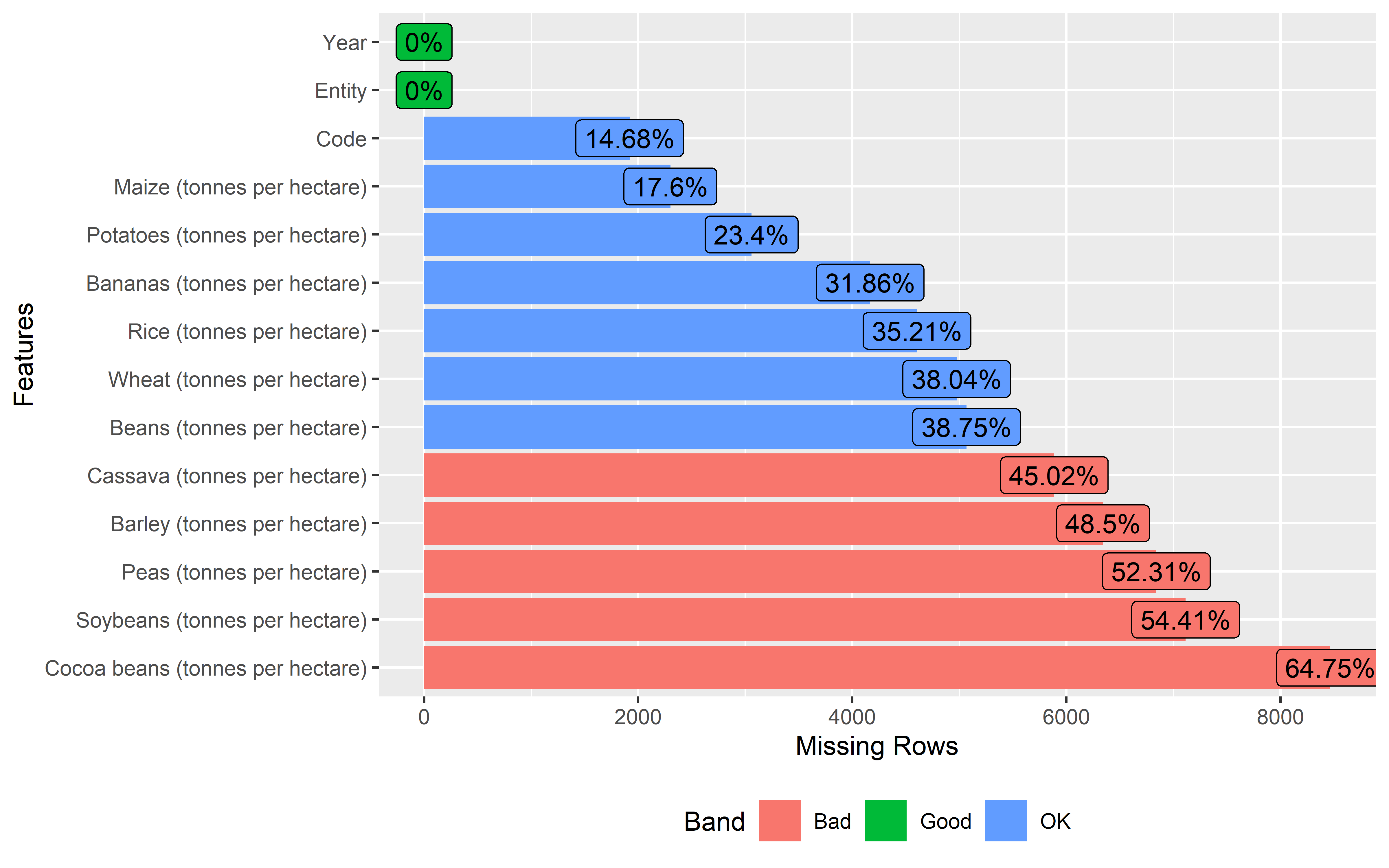
Population data
land %>%
  plot_missing()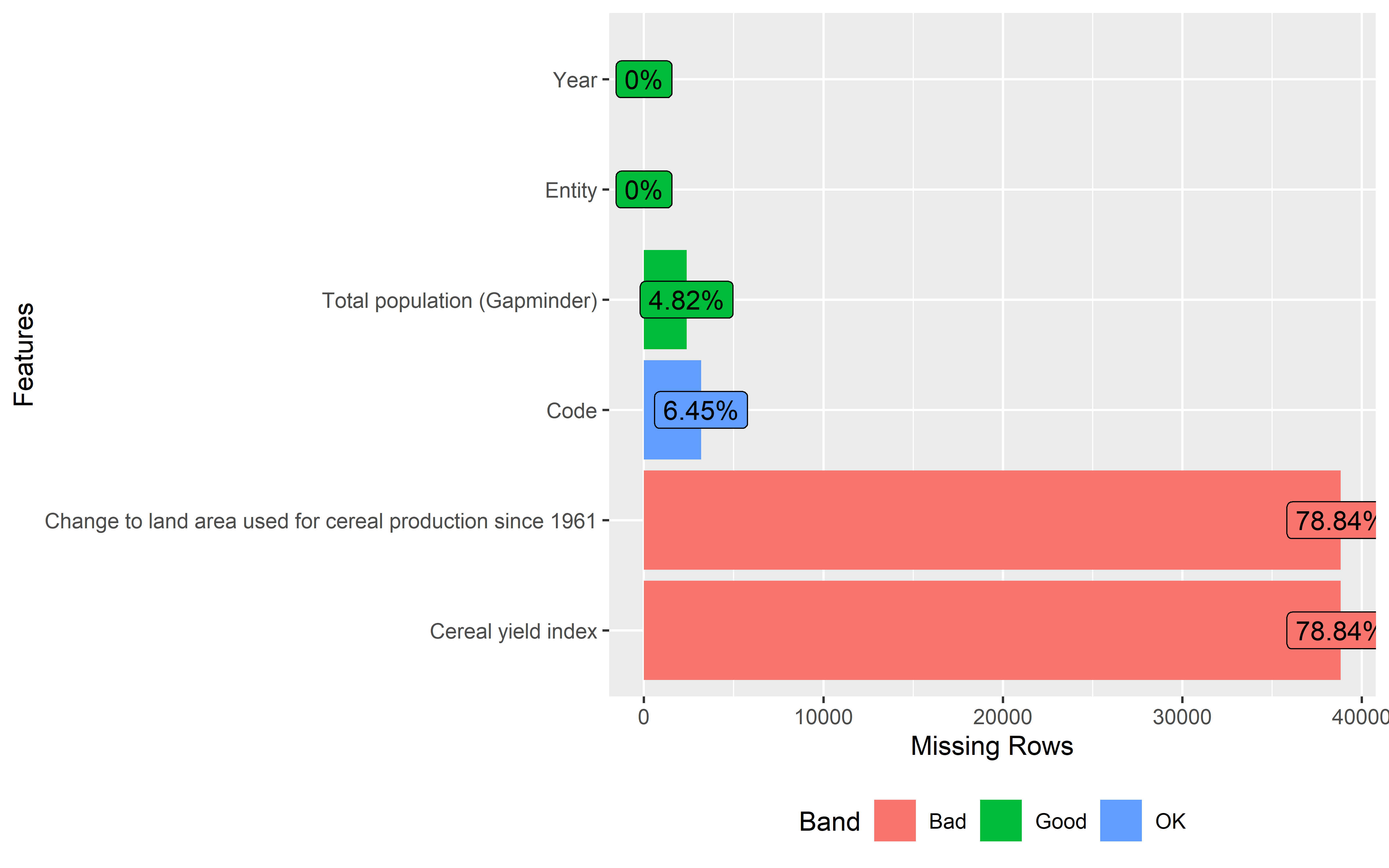
After the data structure, we can start exploring the data distributions. Here, I ’ll start with the population data. Before visualizing the distribution of population, I’ll calculate the population in million column to use instead of raw population data. At first, I’ll only visualize the worldwide population data from 2019.
Population data distribution (2019)
# Population in Millions
Pop <- land %>%
  filter(!is.na(Code)) %>%
  mutate(Year = as.numeric(Year)) %>%
  mutate(pop = `Total population (Gapminder)`/1000000)

## Distribution (2019)
Pop %>%
  filter(Entity != "World") %>%
  group_by(Entity) %>%
  filter(Year == max(Year)) %>%
  ungroup() %>%
  ggplot(aes(x = pop)) +
  geom_histogram(fill = "steelblue") +
  labs(x = "Population", y = "Count") +
  theme_bw()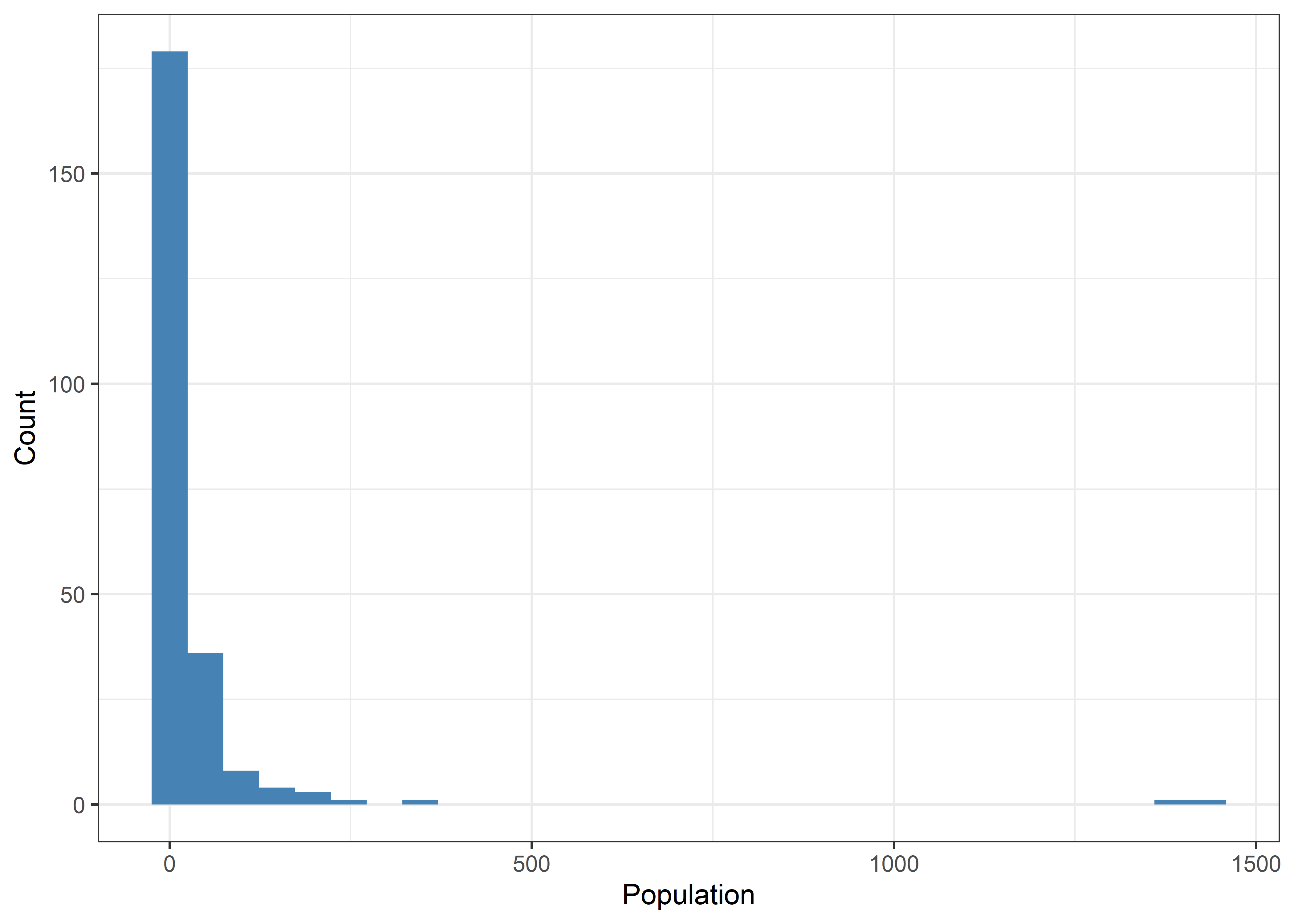
- The population data is right skewed.
Now, I’ll extract the top 10 populated countries and present them along with their population using gt function. gt library is another wonderful package of R that builds professional quality tables in Rmarkdown.
Pop %>%
  filter(Entity != "World") %>%
  group_by(Entity) %>%
  filter(Year == max(Year)) %>%
  ungroup() %>%
  slice_max(pop, n = 10) %>%
  select(Entity, pop) %>%
  rename(Country = Entity, `Population (millions)` = pop) %>%
  gt() %>%
  tab_header(
    title = "Top 10 Populated Countries of the World"
)| Top 10 Populated Countries of the World | |
|---|---|
| Country | Population (millions) |
| China | 1433.784 |
| India | 1366.418 |
| United States | 329.065 |
| Indonesia | 270.626 |
| Pakistan | 216.565 |
| Brazil | 211.050 |
| Nigeria | 200.964 |
| Bangladesh | 163.046 |
| Russia | 145.872 |
| Mexico | 127.576 |
These are the top 10 populated countries according to the data. However, I’ll use only the data from China, India, United States, Pakistan, Brazil and Russia for comparison in subsequent steps.
Now, I’ll plot the worldwide population growth trend from 1900 to 2019. Afterwards, I’ll plot the population growth trends in the selected 6 countries.
Worldwide Population Growth
Pop %>%
  filter(Entity == "World") %>%
  filter(Year>=1900) %>%
  ggplot(aes(x = Year, y = pop)) +
  geom_line() +
  geom_point() +
  labs(x= "Year", y = "Population (Millions)") +
  theme_bw()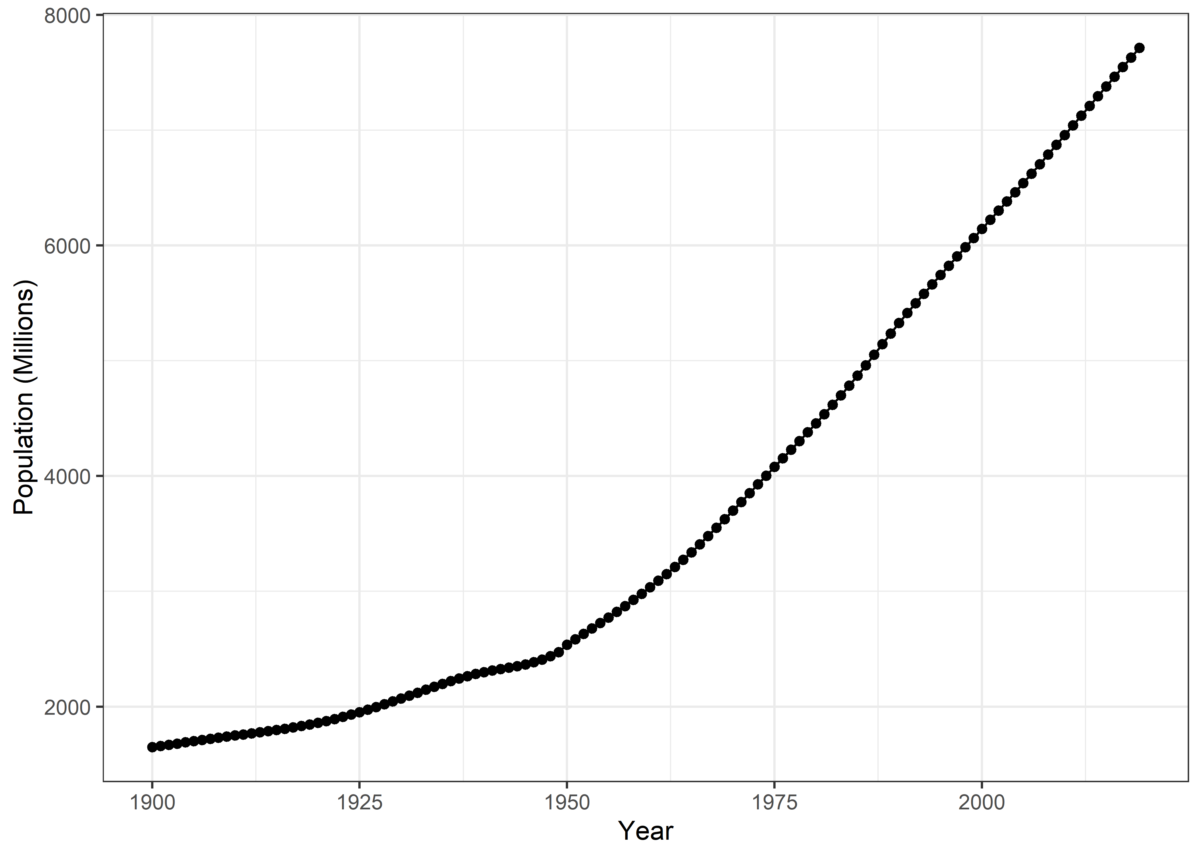
Populated countries
Pop %>%
  filter(Entity %in% c("Pakistan", "United States", "India", "China", "Brazil", "Russia")) %>%
  filter(Year>=1900) %>%
  ggplot(aes(x = Year, y = pop, color = Entity)) +
  geom_line() +
  geom_point() +
  labs(x = "Year", y = "Population (millions)", color = NULL) +
  theme_bw() +
  theme(legend.position = "top")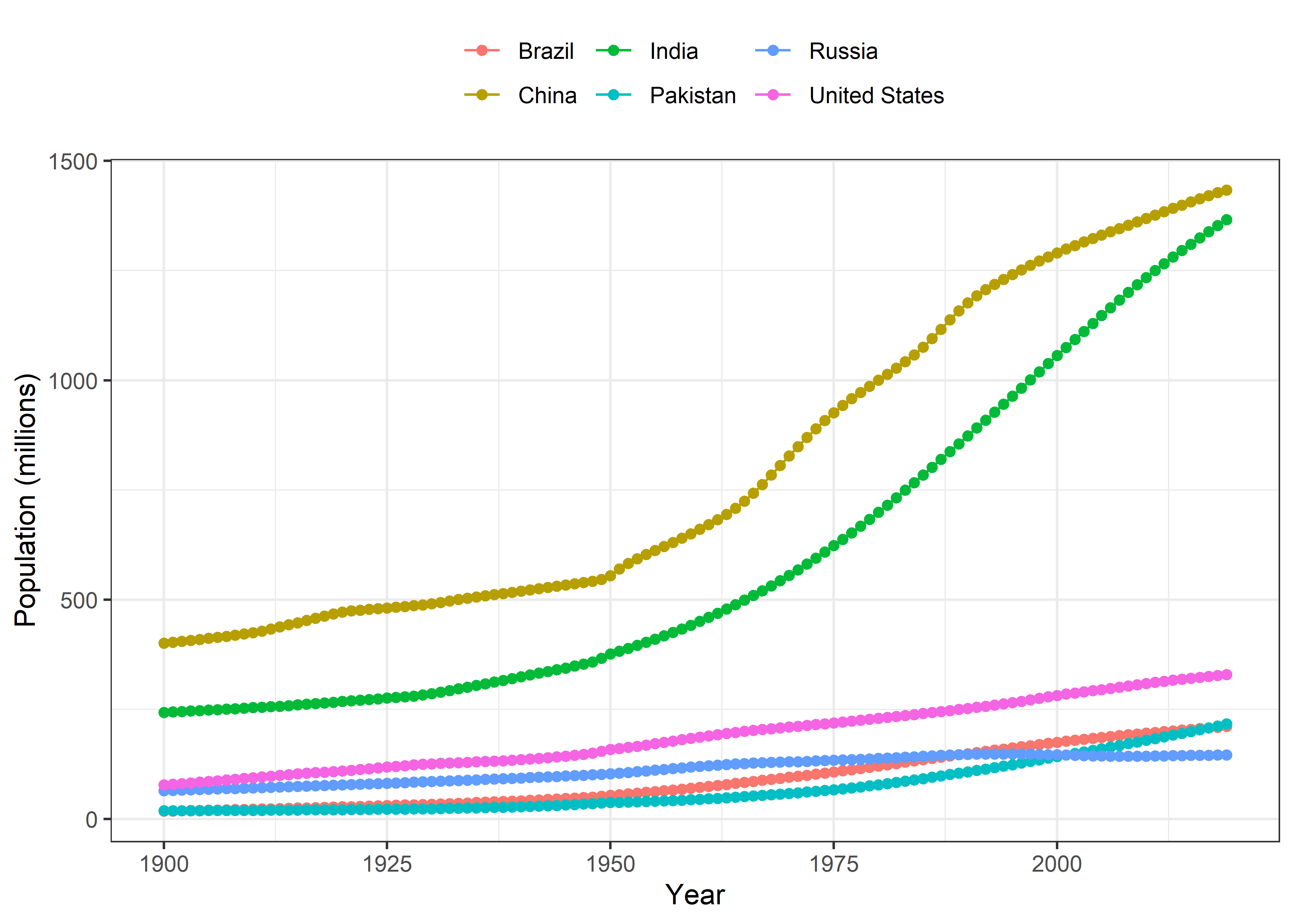
Now, I’ll move towards crop data and will do some cleaning before making visualizations.
At first, I’ll gather the data in a tidy format for subsequent visualizations and data analysis.
Also, I’ll clean the crop names to make them easily readable.
Crop <- crop %>%
  gather(crop, yield, `Wheat (tonnes per hectare)`:`Bananas (tonnes per hectare)`, na.rm = FALSE, convert = TRUE) %>%
  mutate(crop = str_remove(crop, regex(" \\(tonnes per hectare\\)", ignore_case = TRUE)))

Crop
## # A tibble: 143,825 x 5
## Entity Code Year crop yield
## <chr> <chr> <dbl> <chr> <dbl>
## 1 Afghanistan AFG 1961 Wheat 1.02
## 2 Afghanistan AFG 1962 Wheat 0.974
## 3 Afghanistan AFG 1963 Wheat 0.832
## 4 Afghanistan AFG 1964 Wheat 0.951
## 5 Afghanistan AFG 1965 Wheat 0.972
## 6 Afghanistan AFG 1966 Wheat 0.867
## 7 Afghanistan AFG 1967 Wheat 1.12
## 8 Afghanistan AFG 1968 Wheat 1.16
## 9 Afghanistan AFG 1969 Wheat 1.19
## 10 Afghanistan AFG 1970 Wheat 0.956
## # ... with 143,815 more rowsDistribution of crop yields
- Distribution of crop yield data obtained from 1961 to 2019.
Crop %>%
  ggplot(aes(x = yield)) +
  geom_histogram(fill = "steelblue") +
  theme_bw() +
  labs(x = "Yield") +
  facet_wrap(~crop, scales = "free")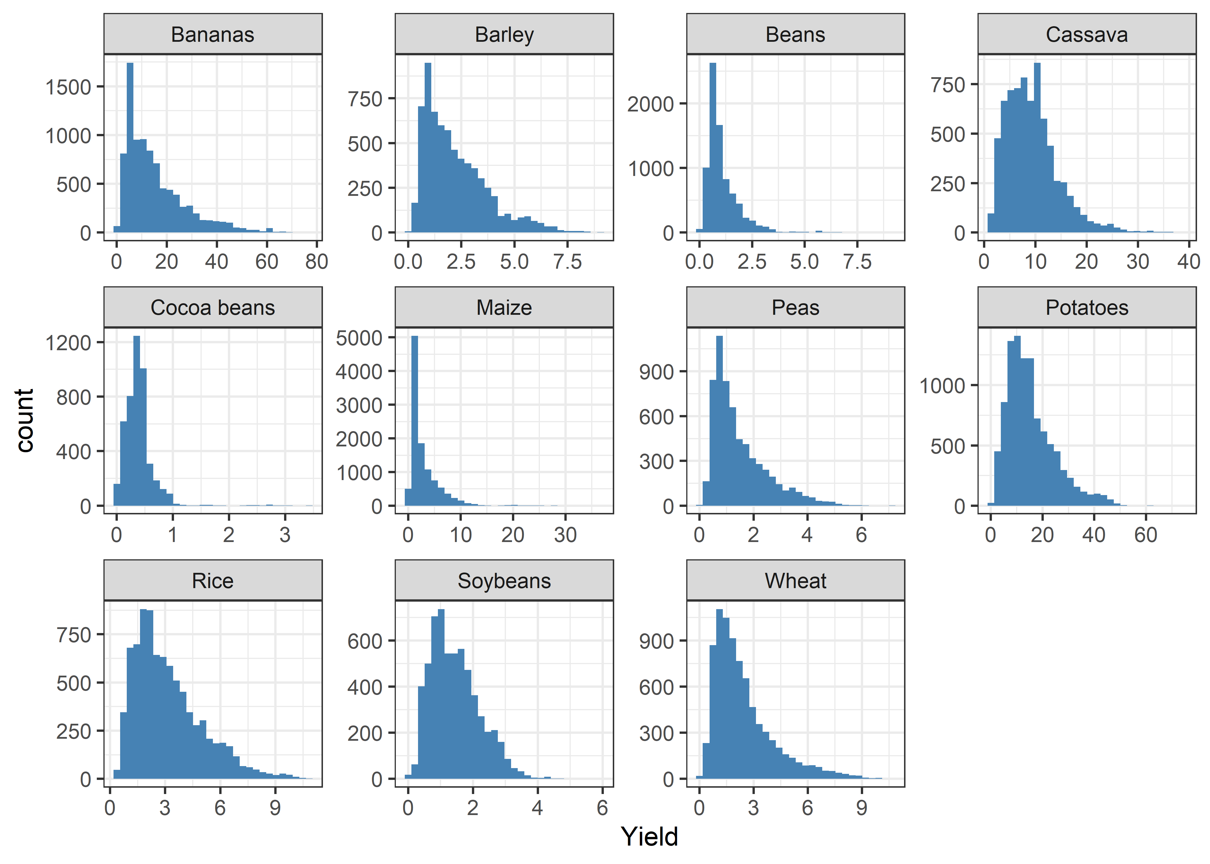
Jitter plots
Crop %>%
  ggplot(aes(x = reorder(crop, yield), y = yield, color = crop)) +
  geom_jitter(position = position_jitter(0.2), alpha = 0.1) +
  labs(x = "Crop", y = "Yield") +
  theme_bw() +
  theme(legend.position = "none")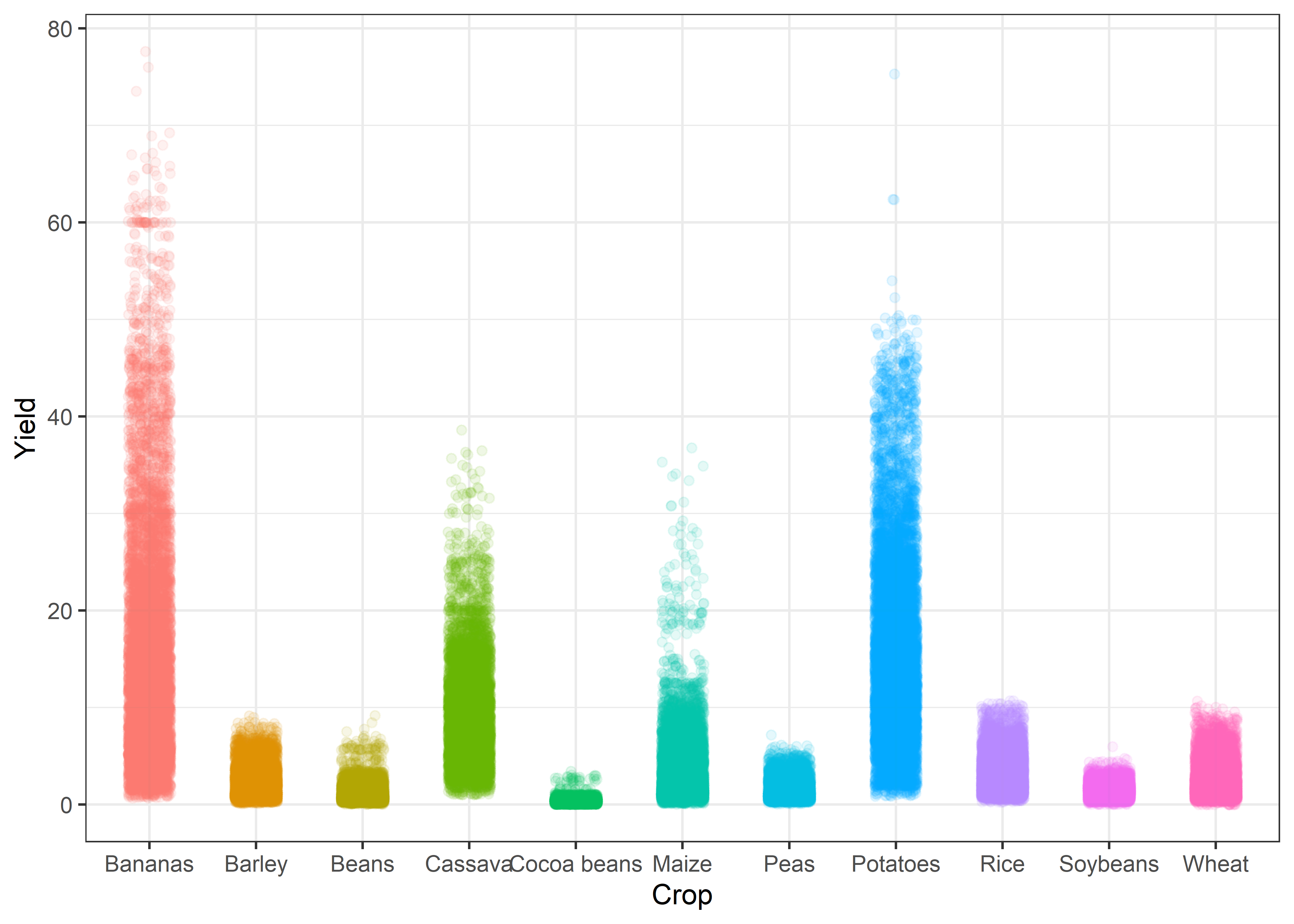
Yield trends
Crop %>%
  group_by(Year, crop) %>%
  summarise(yield = mean(yield, na.rm = TRUE)) %>%
  ggplot(aes(x = Year, y = yield, color = crop)) +
  geom_line() +
  geom_point() +
  labs(x = "Year", y = "Yield (tons per hectare)", color = NULL) +
  theme_bw()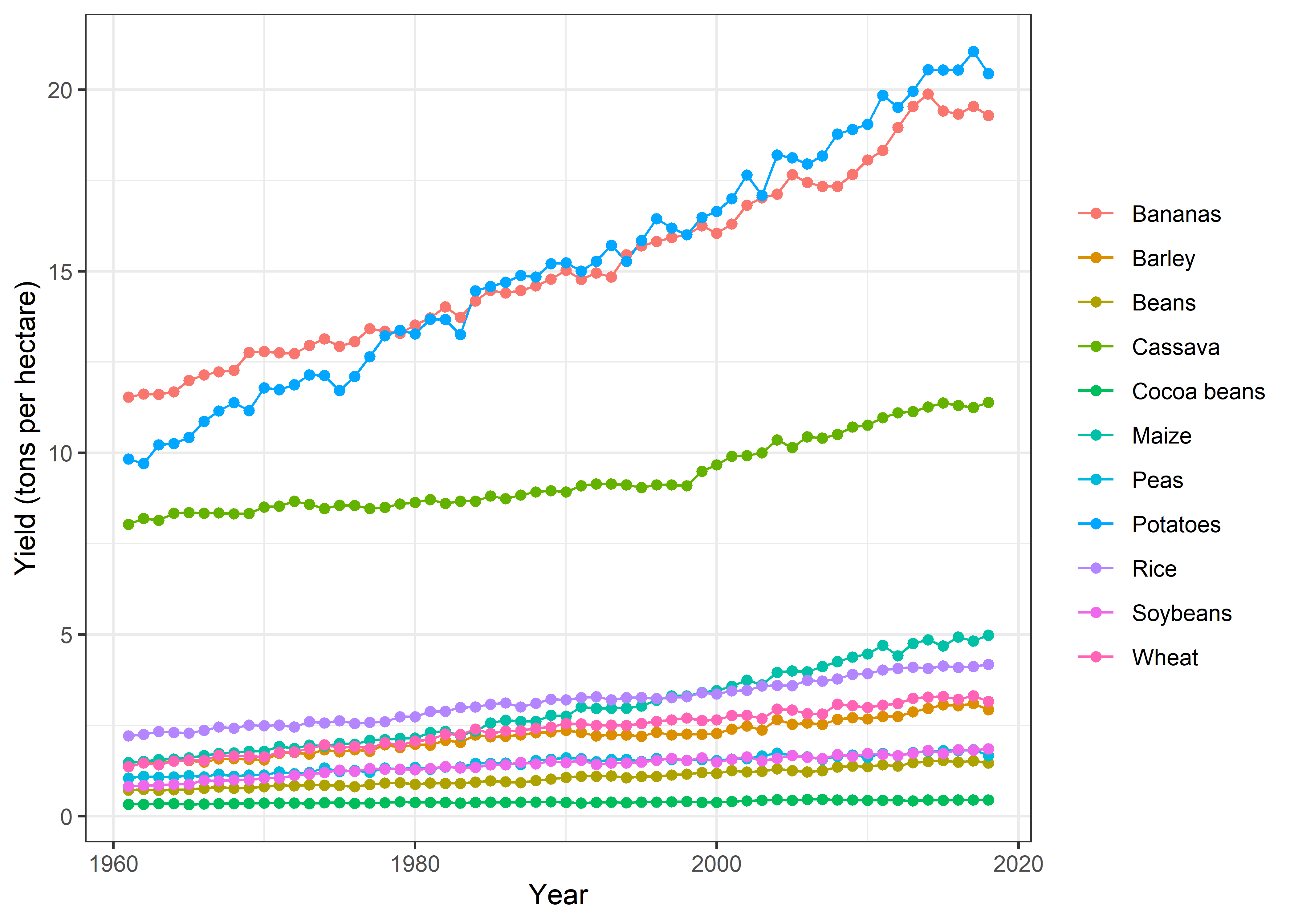
theme(legend.position = "top")## List of 1
## $ legend.position: chr "top"
## - attr(*, "class")= chr [1:2] "theme" "gg"
## - attr(*, "complete")= logi FALSE
## - attr(*, "validate")= logi TRUETrends by Countries
`%nin%` = Negate(`%in%`)

Crop %>%
  filter(Entity %in% c("Pakistan", "United States", "India", "China", "Brazil", "Russia")) %>%
  filter(crop %nin% c("Cassava", "Cocoa beans")) %>%
  group_by(Entity, Year, crop) %>%
  summarise(yield = mean(yield, na.rm = TRUE)) %>%
  ggplot(aes(x = Year, y = yield, color = Entity)) +
  geom_line() +
  geom_point() +
  labs(x = "Year", y = "Yield (tons per hectare)", color = NULL) +
  theme_bw() +
  facet_wrap(~crop, scales = "free") +
  theme(legend.position = "top")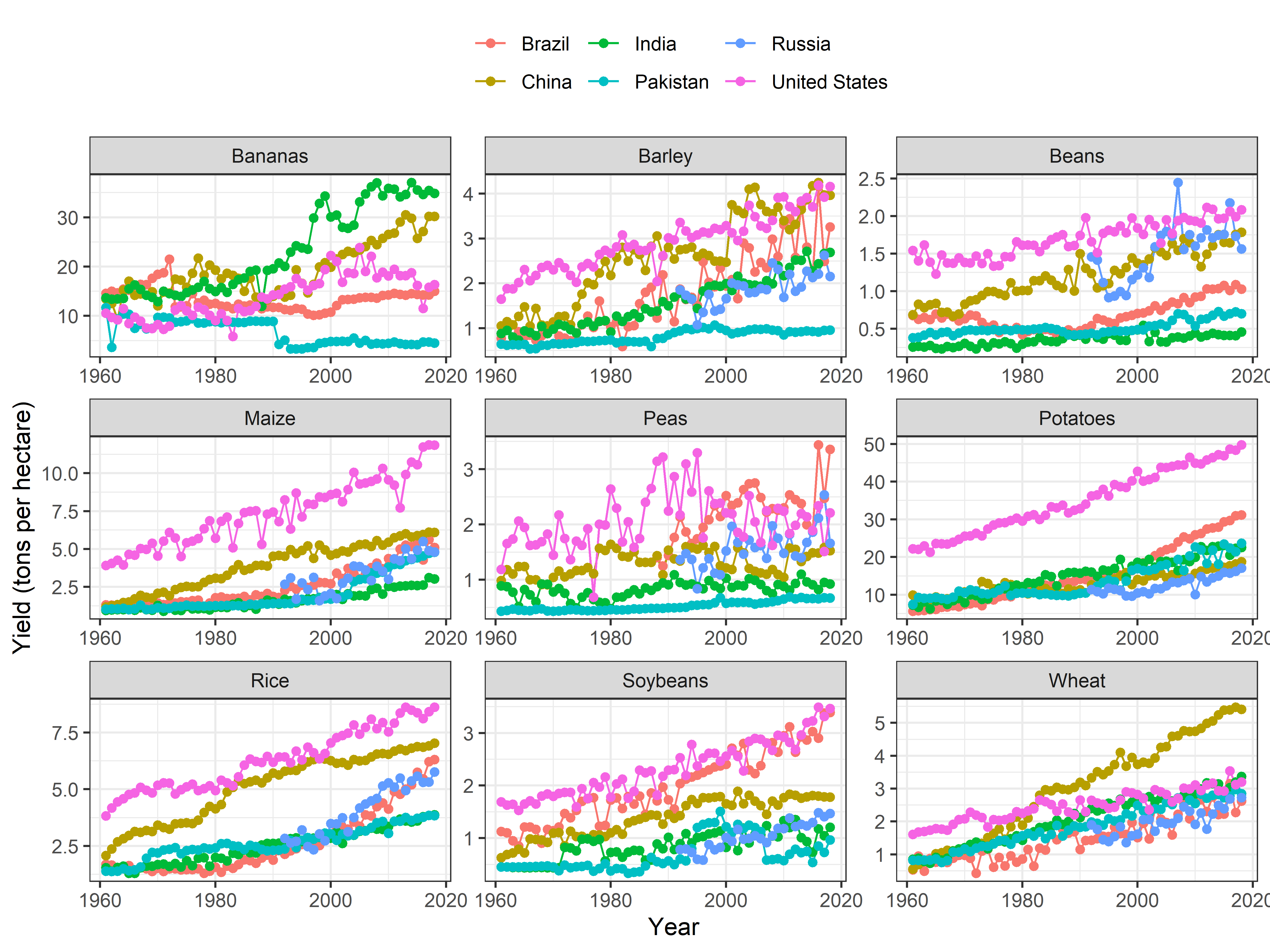
Now, I’ll plot both the population growth and per hectare yield change over time in same graph. These plots will visualize the change in population and crop yield over time simultaneously. At first, I’ll join both the crop and population data sets for the six most populated countries using the left_join function in dplyr package. For population data, I’ll filter the data after 1960 to match with crop production data.
Pop_Crop <- Pop %>%
  filter(Entity %in% c("Pakistan", "United States", "India", "China", "Brazil", "Russia")) %>%
  filter(Year >= 1960) %>%
  unite(ID, Entity, Year, sep = "_", remove = FALSE, na.rm = FALSE) %>%
  left_join(
            Crop %>%
              filter(Entity %in% c("Pakistan", "United States", "India", "China", "Brazil", "Russia")) %>%
              unite(ID, Entity, Year, sep = "_", remove = FALSE, na.rm = FALSE) %>%
              select(-Entity, -Code, -Year),
            by = c("ID" = "ID")
  )
Joint Trends
- At first, I’ll present the joint crop yield and population trends of each country separately.
By Country
China
cols <- c("Yield" = "#08519c", "Population" = "red")

Pop_Crop %>%
  filter(Entity == "China" & !is.na(crop)) %>%
  filter(crop %nin% c("Cassava", "Cocoa beans")) %>%
  ggplot(aes(x = Year)) +
  geom_line(aes(y = yield, colour = "Yield")) +
  geom_line(aes(y = 0.05*pop, color = "Population"), group = 1) +
  scale_y_continuous(sec.axis = sec_axis(~./0.05, name = "Population (millions)")) +
  scale_colour_manual("", values=cols) +
  labs(y = "Yield (tons per hectare)", color = "Legend") +
  theme_bw() +
  facet_wrap(~crop, scales = "free") +
   theme(legend.position = "top")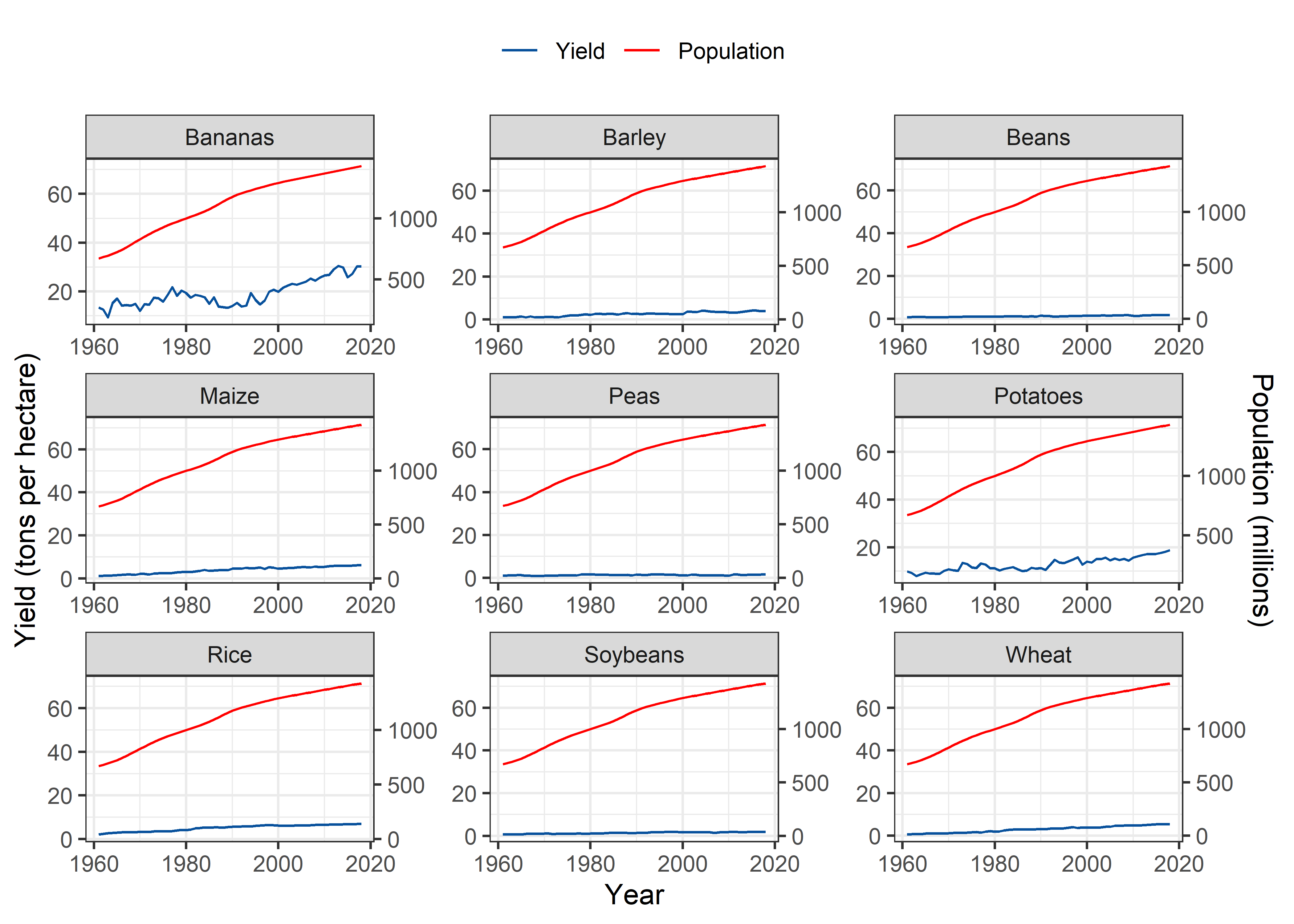
India
Pop_Crop %>%
  filter(Entity == "India" & !is.na(crop)) %>%
  filter(crop %nin% c("Cassava", "Cocoa beans")) %>%
  ggplot(aes(x = Year)) +
  geom_line(aes(y = yield, colour = "Yield")) +
  geom_line(aes(y = 0.05*pop, color = "Population"), group = 1) +
  scale_y_continuous(sec.axis = sec_axis(~./0.05, name = "Population (millions)")) +
  scale_colour_manual("", values=cols) +
  labs(y = "Yield (tons per hectare)", color = "Legend") +
  theme_bw() +
  facet_wrap(~crop, scales = "free") +
   theme(legend.position = "top")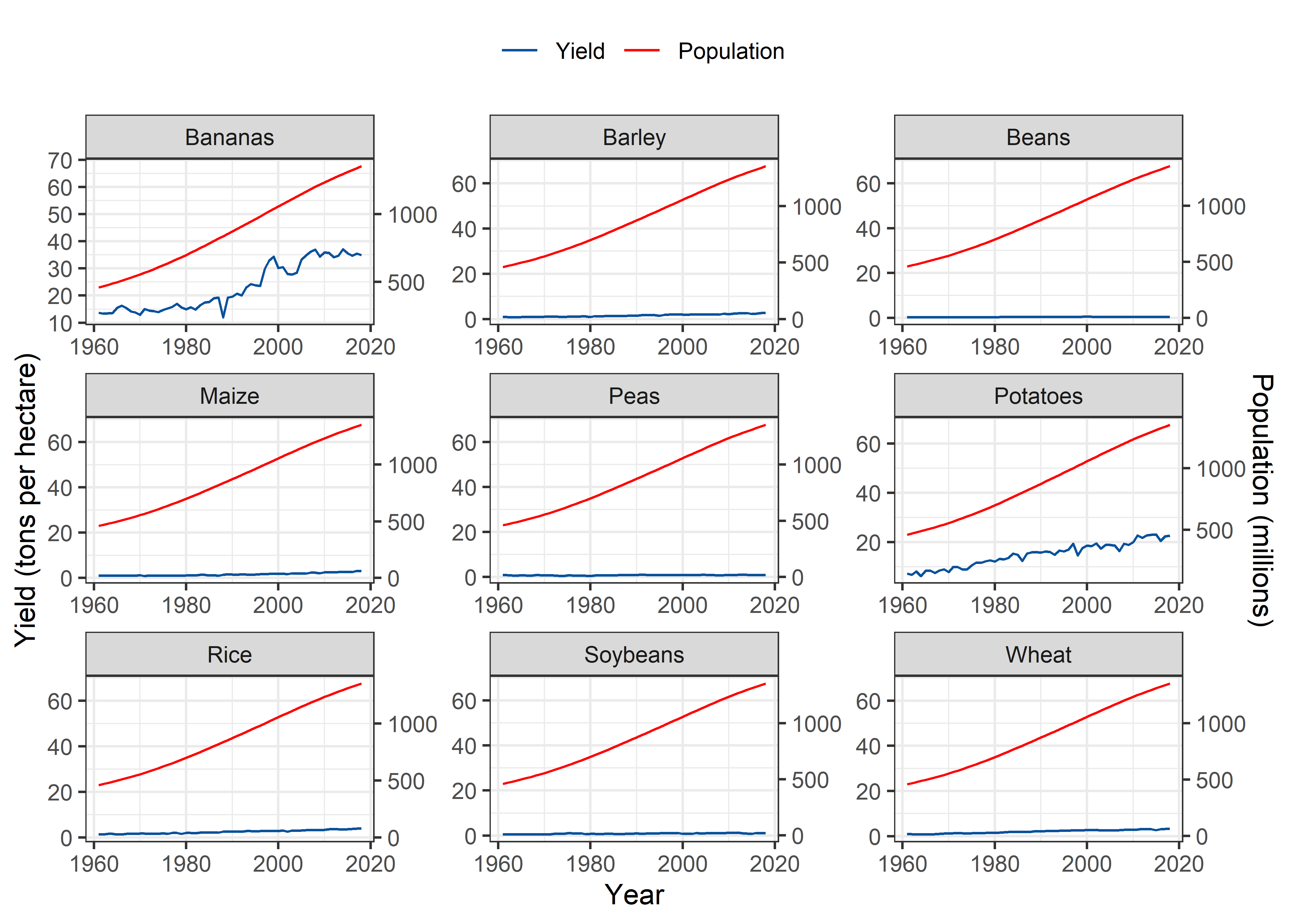
United States
Pop_Crop %>%
  filter(Entity == "United States" & !is.na(crop)) %>%
  filter(crop %nin% c("Cassava", "Cocoa beans")) %>%
  ggplot(aes(x = Year)) +
  geom_line(aes(y = yield, colour = "Yield")) +
  geom_line(aes(y = 0.05*pop, color = "Population"), group = 1) +
  scale_y_continuous(sec.axis = sec_axis(~./0.05, name = "Population (millions)")) +
  scale_colour_manual("", values=cols) +
  labs(y = "Yield (tons per hectare)", color = "Legend") +
  theme_bw() +
  facet_wrap(~crop, scales = "free") +
   theme(legend.position = "top")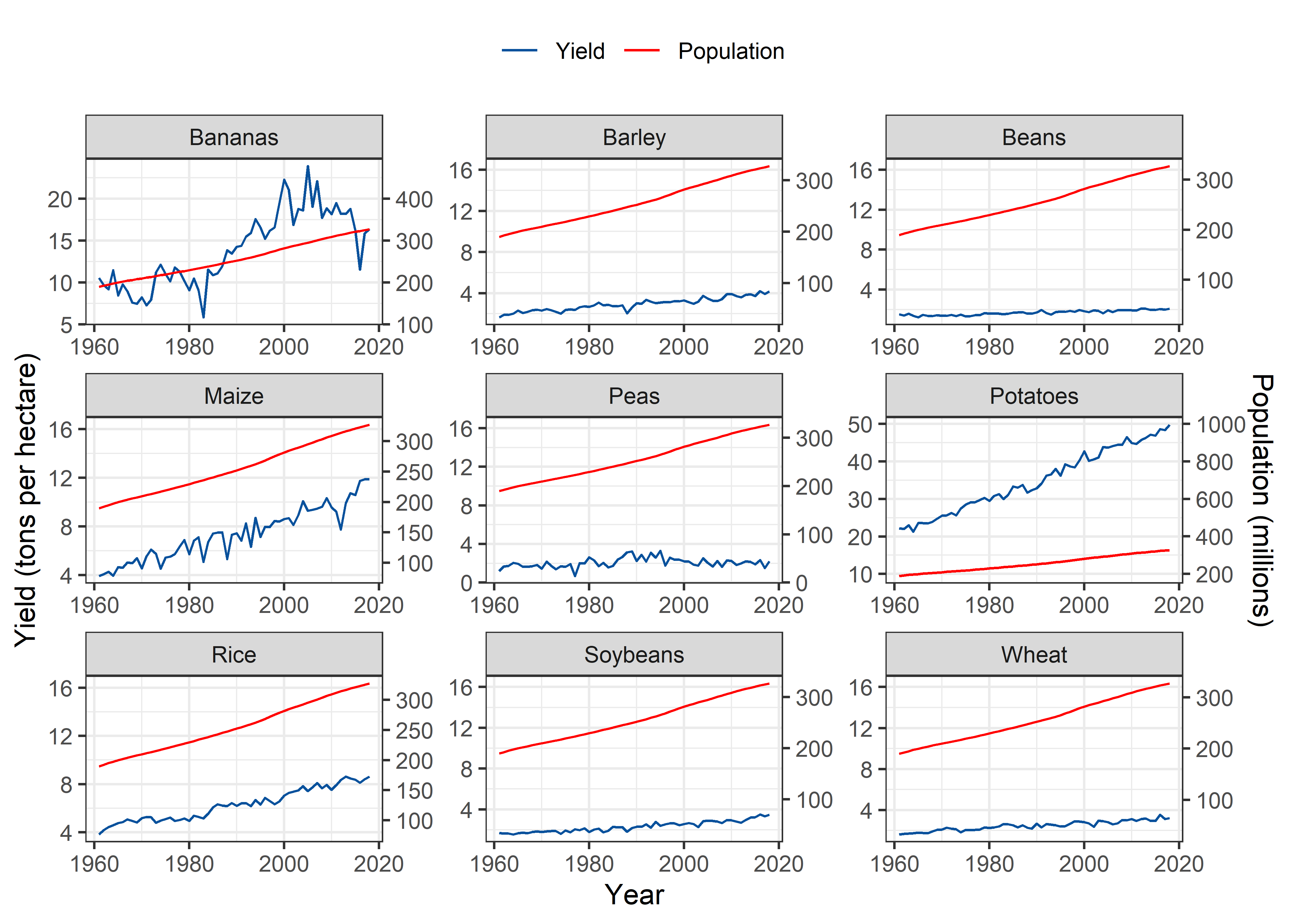
Pakistan
Pop_Crop %>%
  filter(Entity == "Pakistan" & !is.na(crop)) %>%
  filter(crop %nin% c("Cassava", "Cocoa beans")) %>%
  ggplot(aes(x = Year)) +
  geom_line(aes(y = yield, colour = "Yield")) +
  geom_line(aes(y = 0.05*pop, color = "Population"), group = 1) +
  scale_y_continuous(sec.axis = sec_axis(~./0.05, name = "Population (millions)")) +
  scale_colour_manual("", values=cols) +
  labs(y = "Yield (tons per hectare)", color = "Legend") +
  theme_bw() +
  facet_wrap(~crop, scales = "free") +
   theme(legend.position = "top")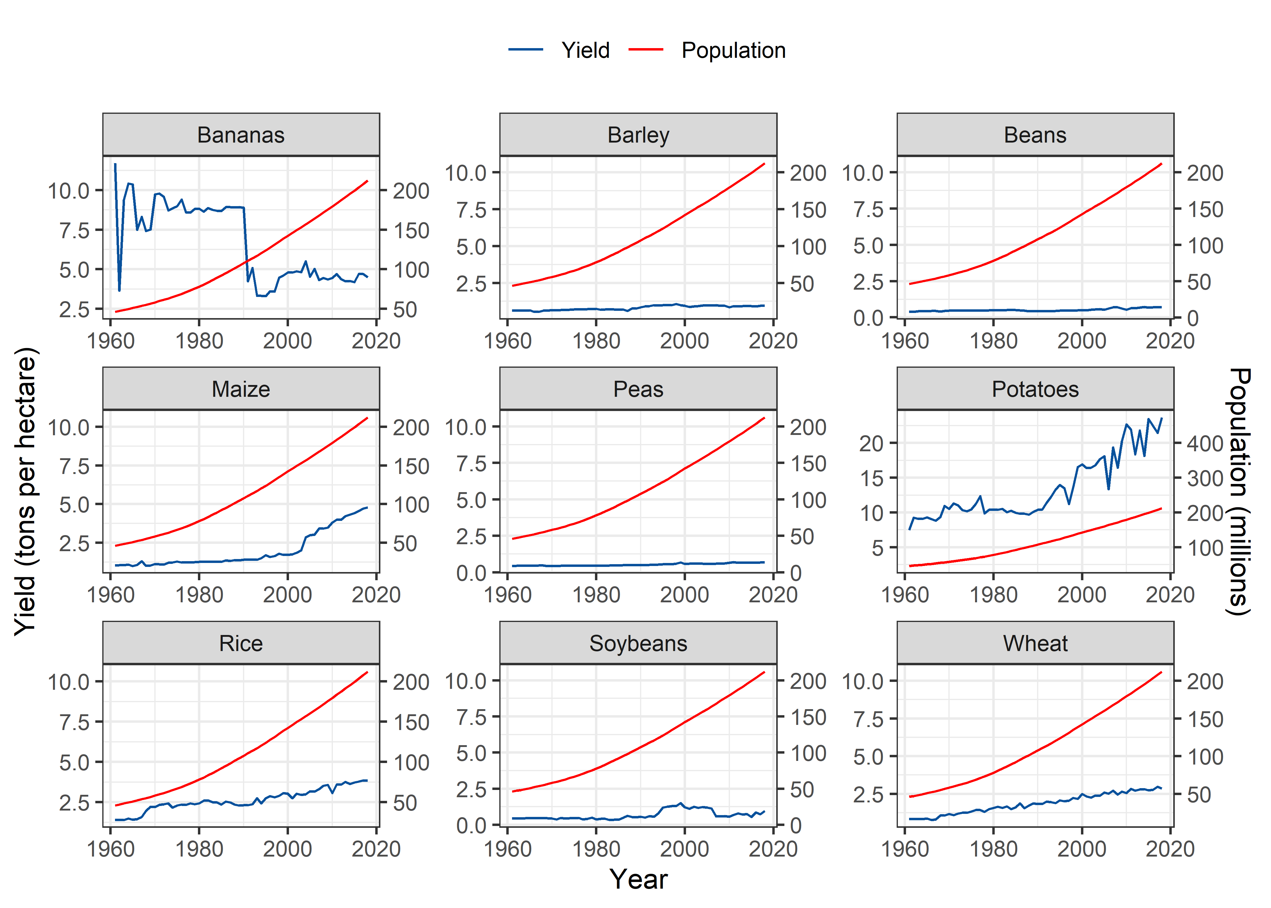
Brazil
Pop_Crop %>%
  filter(Entity == "Brazil" & !is.na(crop)) %>%
  filter(crop %nin% c("Cassava", "Cocoa beans")) %>%
  ggplot(aes(x = Year)) +
  geom_line(aes(y = yield, colour = "Yield")) +
  geom_line(aes(y = 0.05*pop, color = "Population"), group = 1) +
  scale_y_continuous(sec.axis = sec_axis(~./0.05, name = "Population (millions)")) +
  scale_colour_manual("", values=cols) +
  labs(y = "Yield (tons per hectare)", color = "Legend") +
  theme_bw() +
  facet_wrap(~crop, scales = "free") +
   theme(legend.position = "top")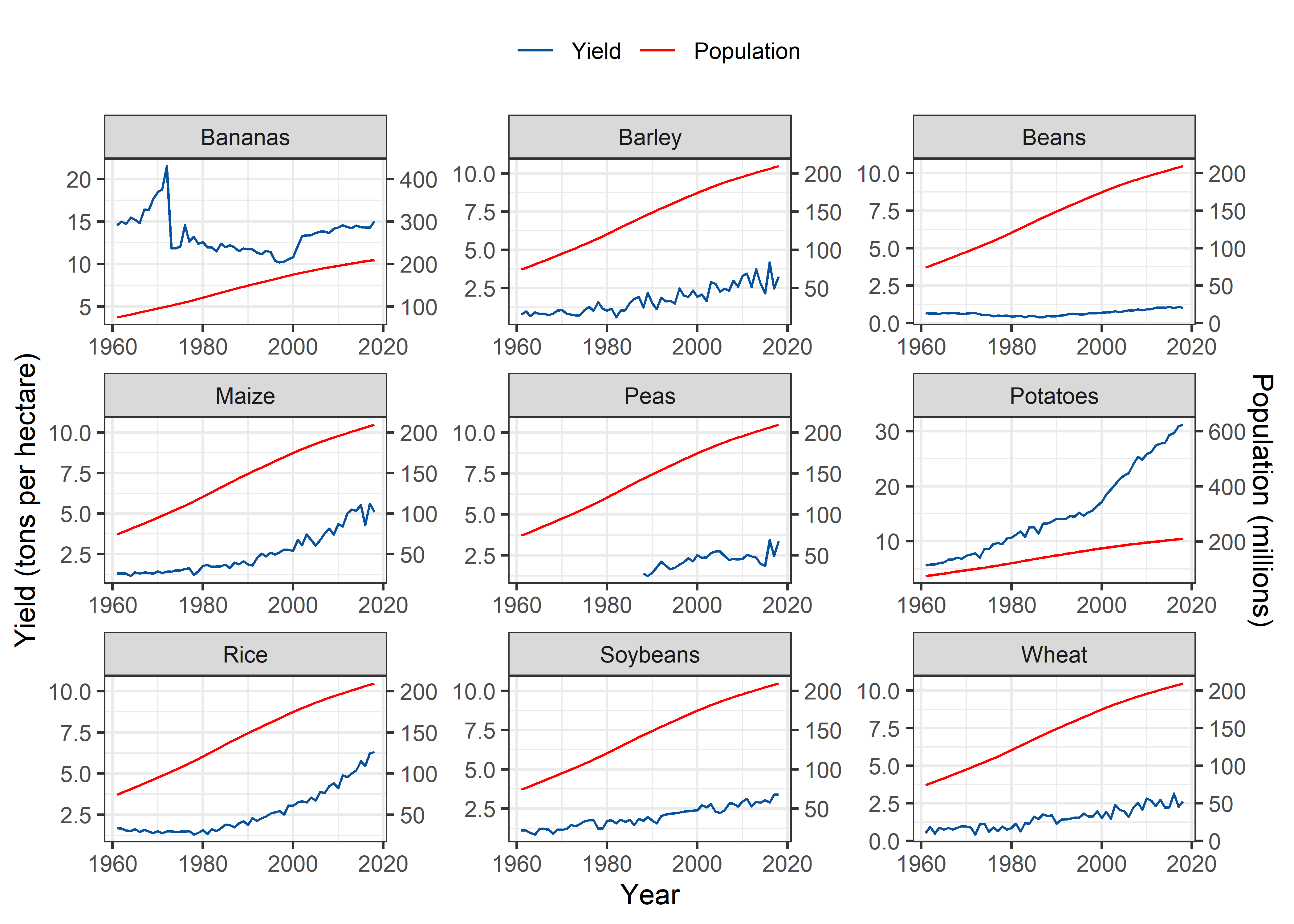
Russia
Pop_Crop %>%
  filter(Entity == "Russia" & !is.na(crop)) %>%
  filter(crop %nin% c("Cassava", "Cocoa beans")) %>%
  ggplot(aes(x = Year)) +
  geom_line(aes(y = yield, colour = "Yield")) +
  geom_line(aes(y = 0.05*pop, color = "Population"), group = 1) +
  scale_y_continuous(sec.axis = sec_axis(~./0.05, name = "Population (millions)")) +
  scale_colour_manual("", values=cols) +
  labs(y = "Yield (tons per hectare)", color = "Legend") +
  theme_bw() +
  facet_wrap(~crop, scales = "free") +
   theme(legend.position = "top")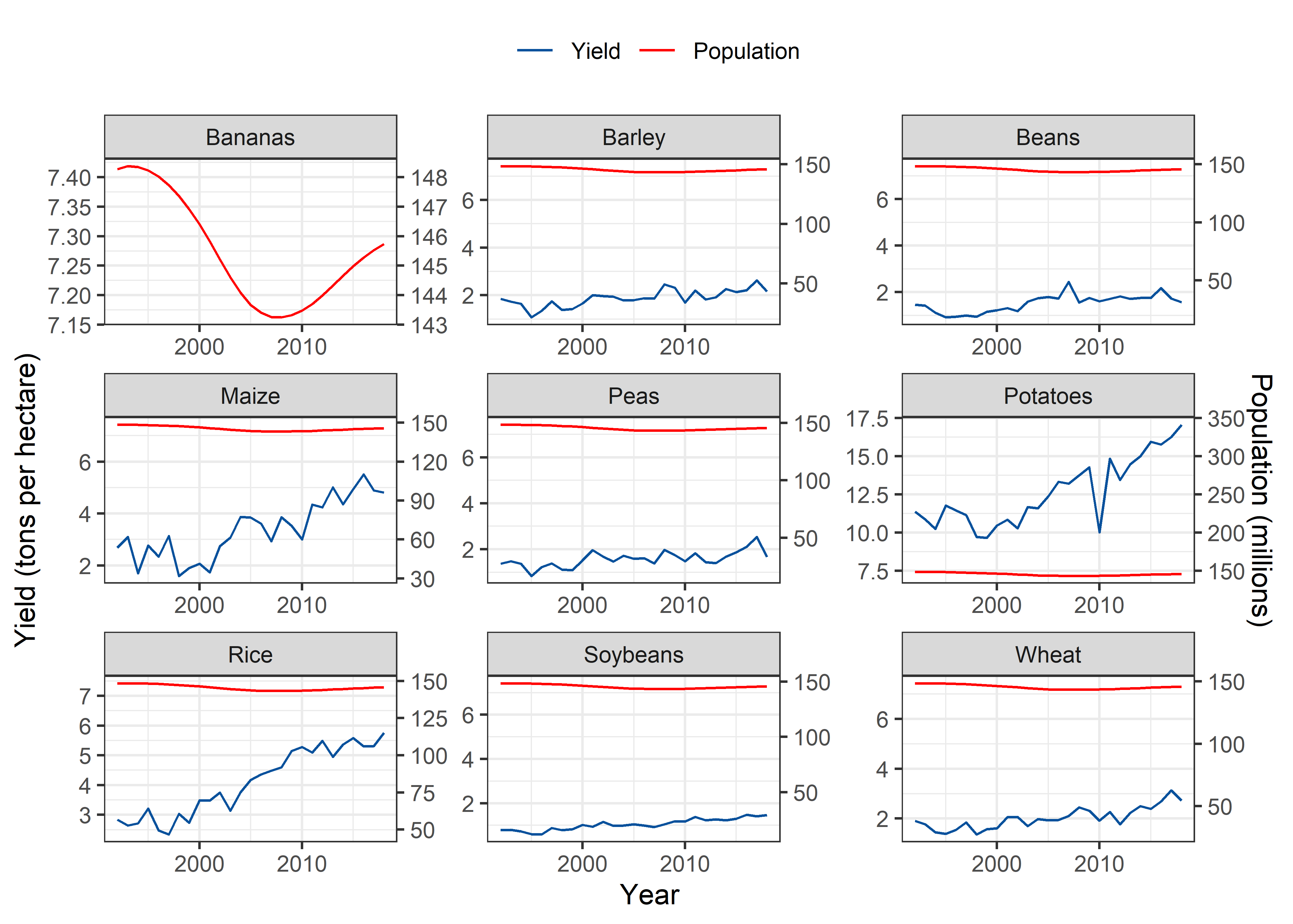
By Crop
- Now, I’ll plot these joint trends by crop to compare the populated countries simultaneously.
Wheat
Pop_Crop %>%
  filter(!is.na(crop)) %>%
  filter(crop == "Wheat") %>%
  ggplot(aes(x = Year)) +
  geom_line(aes(y = yield, colour = "Yield")) +
  geom_line(aes(y = 0.05*pop, color = "Population"), group = 1) +
  scale_y_continuous(sec.axis = sec_axis(~./0.05, name = "Population (millions)")) +
  scale_colour_manual("", values=cols) +
  labs(y = "Yield (tons per hectare)", color = "Legend") +
  theme_bw() +
  facet_wrap(~Entity, scales = "free") +
  theme(legend.position = "top")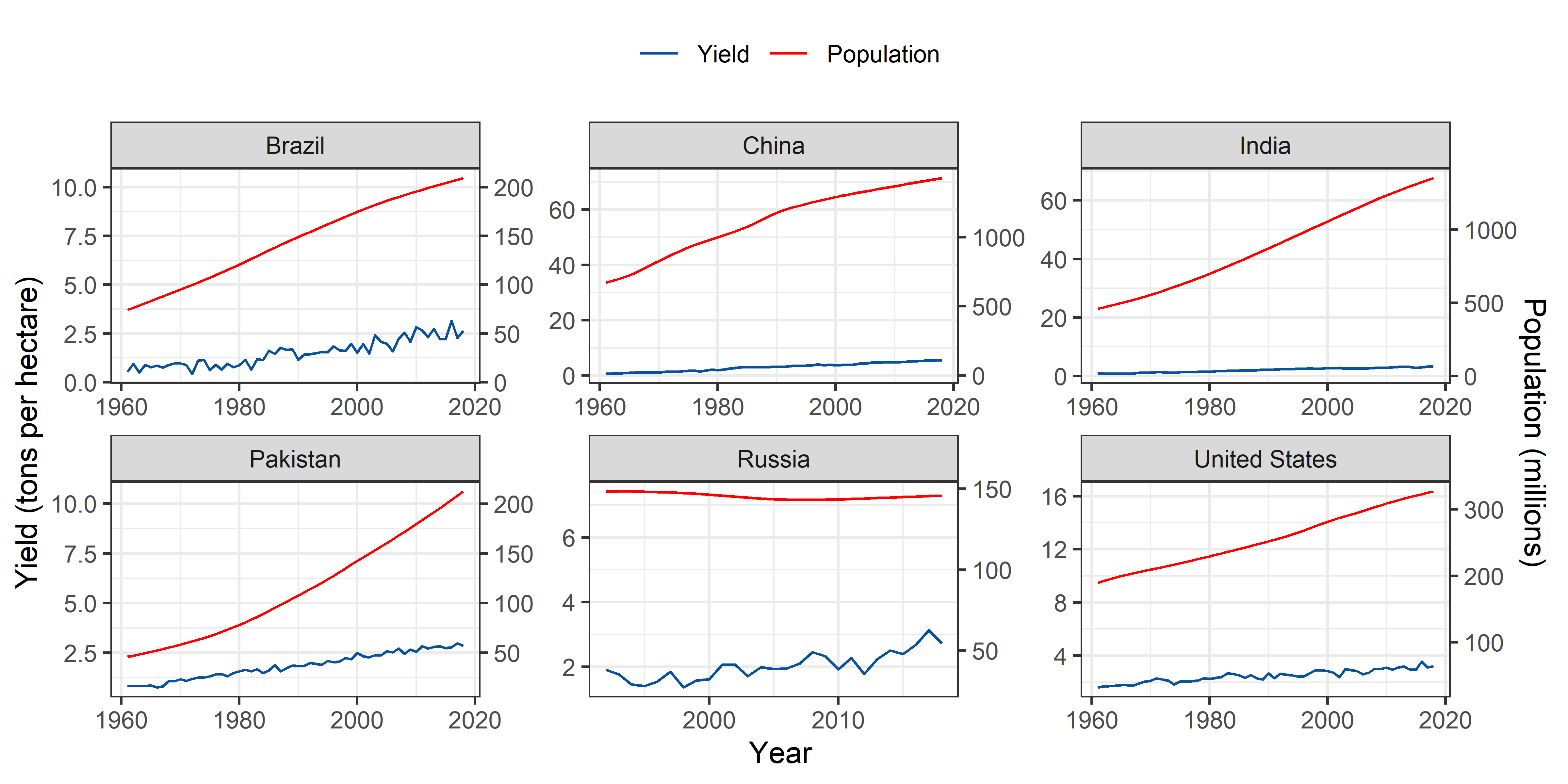
Rice
Pop_Crop %>%
  filter(!is.na(crop)) %>%
  filter(crop == "Rice") %>%
  ggplot(aes(x = Year)) +
  geom_line(aes(y = yield, colour = "Yield")) +
  geom_line(aes(y = 0.05*pop, color = "Population"), group = 1) +
  scale_y_continuous(sec.axis = sec_axis(~./0.05, name = "Population (millions)")) +
  scale_colour_manual("", values=cols) +
  labs(y = "Yield (tons per hectare)", color = "Legend") +
  theme_bw() +
  facet_wrap(~Entity, scales = "free") +
  theme(legend.position = "top")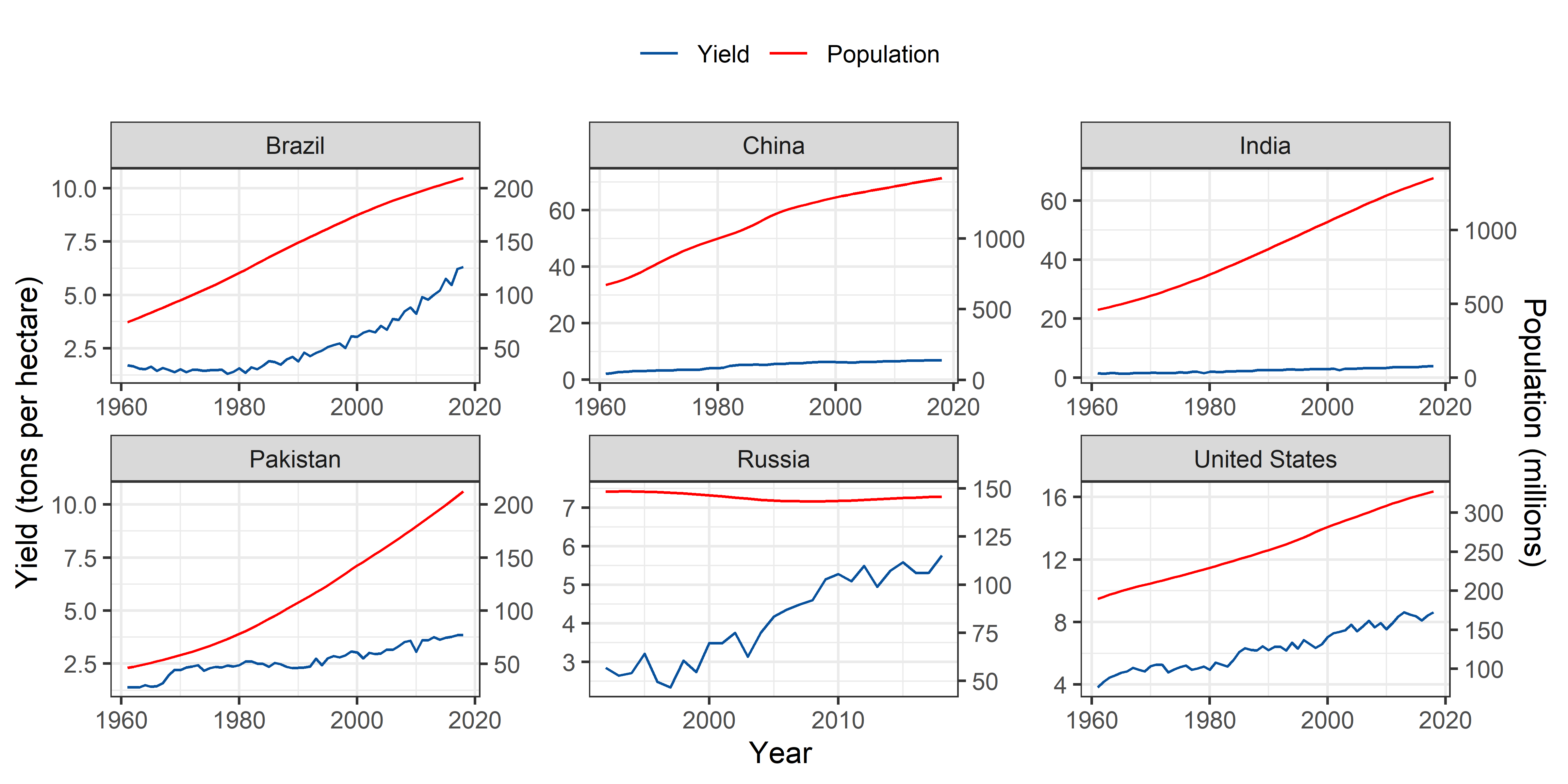
Maize
Pop_Crop %>%
  filter(!is.na(crop)) %>%
  filter(crop == "Maize") %>%
  ggplot(aes(x = Year)) +
  geom_line(aes(y = yield, colour = "Yield")) +
  geom_line(aes(y = 0.05*pop, color = "Population"), group = 1) +
  scale_y_continuous(sec.axis = sec_axis(~./0.05, name = "Population (millions)")) +
  scale_colour_manual("", values=cols) +
  labs(y = "Yield (tons per hectare)", color = "Legend") +
  theme_bw() +
  facet_wrap(~Entity, scales = "free") +
  theme(legend.position = "top")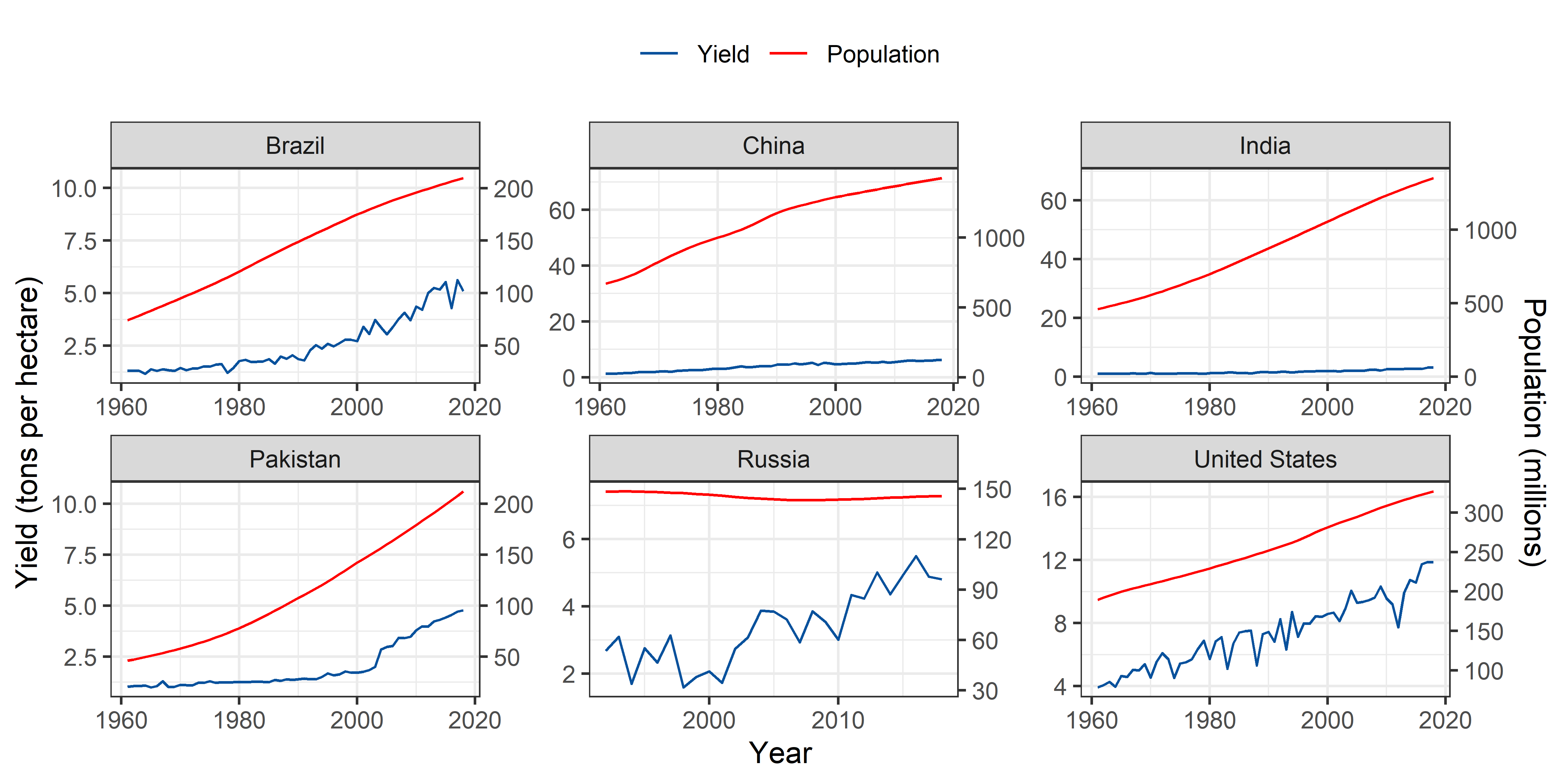
Potatoes
Pop_Crop %>%
  filter(!is.na(crop)) %>%
  filter(crop == "Potatoes") %>%
  ggplot(aes(x = Year)) +
  geom_line(aes(y = yield, colour = "Yield")) +
  geom_line(aes(y = 0.05*pop, color = "Population"), group = 1) +
  scale_y_continuous(sec.axis = sec_axis(~./0.05, name = "Population (millions)")) +
  scale_colour_manual("", values=cols) +
  labs(y = "Yield (tons per hectare)", color = "Legend") +
  theme_bw() +
  facet_wrap(~Entity, scales = "free") +
  theme(legend.position = "top")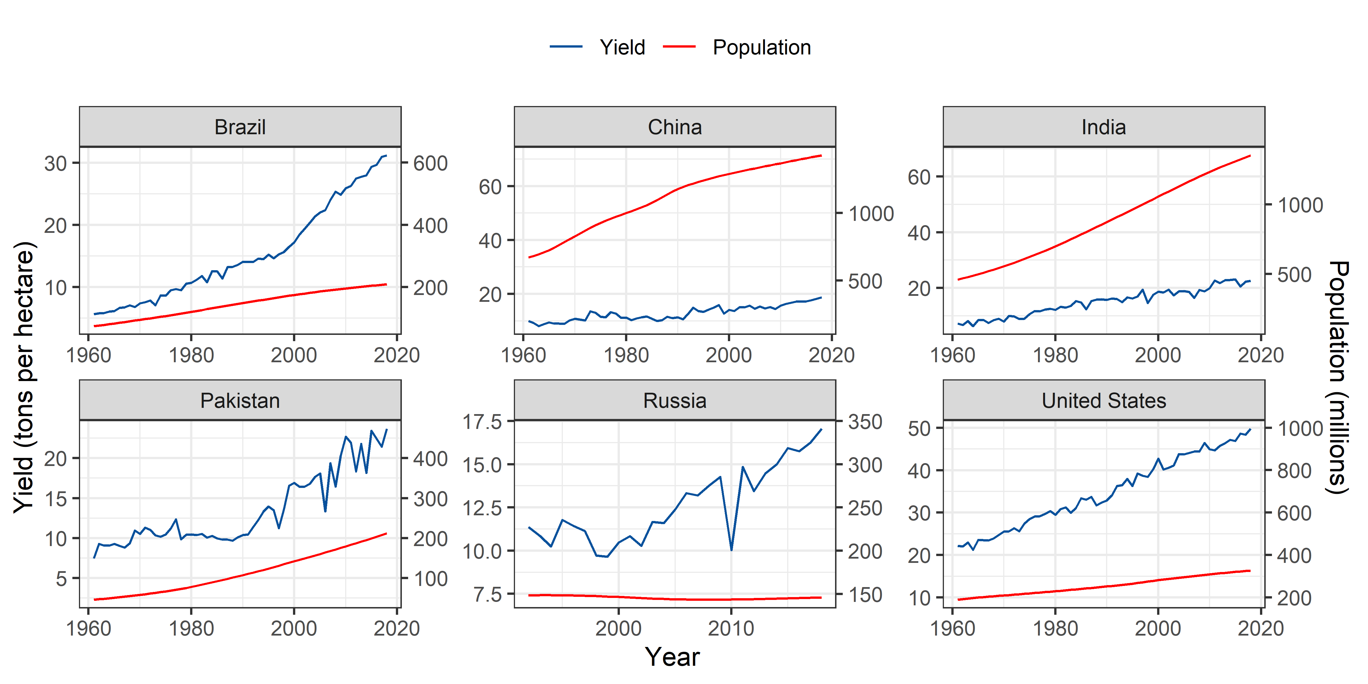
Soybeans
Pop_Crop %>%
  filter(!is.na(crop)) %>%
  filter(crop == "Soybeans") %>%
  ggplot(aes(x = Year)) +
  geom_line(aes(y = yield, colour = "Yield")) +
  geom_line(aes(y = 0.05*pop, color = "Population"), group = 1) +
  scale_y_continuous(sec.axis = sec_axis(~./0.05, name = "Population (millions)")) +
  scale_colour_manual("", values=cols) +
  labs(y = "Yield (tons per hectare)", color = "Legend") +
  theme_bw() +
  facet_wrap(~Entity, scales = "free") +
  theme(legend.position = "top")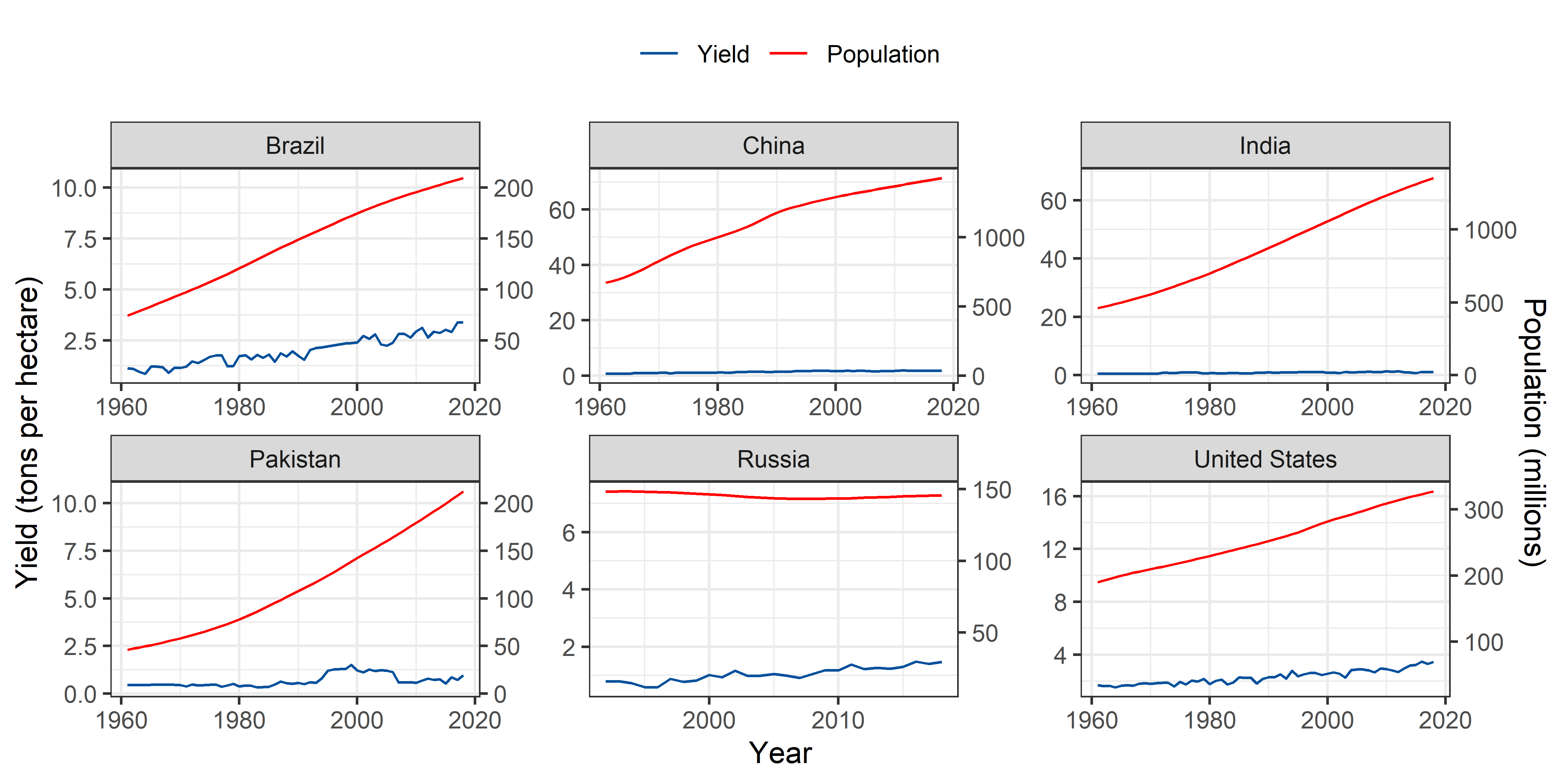
Note: Readers can use this code to produce maps for other crops.
Modeling per hectare crop yield over time
Now, I’ll use simple linear models to estimate the improvement in crop yield (tons per hectare) per year. For this purpose, I’ll use tidymodels library. In tidymodels, we can optimally use the tidy functionality to analyze data without creating subsets of data. We can nest the variables for which we want to run the model simultaneously.
For instance, I want to model yield per hectare over years for all of the provided crops in the selected six populated countries. I can easily remove the unwanted columns from the data and then can nest the yield and year information for subsequent linear regression analysis. After the analysis, I can easily un-nest the tidied information of the model fits including slop coefficients, standard error, confidence intervals and p-value.
- Slop coefficient = change in crop yield (tons per hectare ) per year.
slopes <- Pop_Crop %>%
  select(-ID, -Code, -`Cereal yield index`, -`Change to land area used for cereal production since 1961`, -`Total population (Gapminder)`, -pop) %>%
  filter(crop %nin% c("Cassava", "Cocoa beans") & !is.na(yield)) %>%
  nest(yields = c(Year, yield)) %>%
  mutate(
    fit = map(yields, ~ lm(yield ~ Year, data = .x))
    ) %>%
  mutate(tidied = map(fit, tidy)) %>%
  unnest(tidied) %>%
  filter(term == "Year") %>%
  mutate(p.value = p.adjust(p.value)) %>%
  select(-yields, -fit)

slopes
## # A tibble: 53 x 7
## Entity crop term estimate std.error statistic p.value
## <chr> <chr> <chr> <dbl> <dbl> <dbl> <dbl>
## 1 Brazil Wheat Year 0.0366 0.00222 16.5 1.17e-21
## 2 Brazil Rice Year 0.0755 0.00490 15.4 2.22e-20
## 3 Brazil Maize Year 0.0709 0.00395 18.0 1.96e-23
## 4 Brazil Soybeans Year 0.0388 0.00154 25.1 1.48e-30
## 5 Brazil Potatoes Year 0.440 0.0148 29.7 2.51e-34
## 6 Brazil Beans Year 0.00770 0.00113 6.81 9.10e- 8
## 7 Brazil Barley Year 0.0466 0.00319 14.6 2.30e-19
## 8 Brazil Bananas Year -0.0349 0.0169 -2.06 4.36e- 2
## 9 Brazil Peas Year 0.0385 0.00717 5.37 7.30e- 5
## 10 China Wheat Year 0.0880 0.00141 62.6 8.23e-52
## # ... with 43 more rowsVisualization of slope coefficients
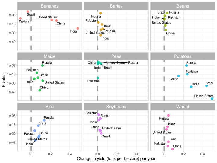
- Now, I’ll visualize the slope coefficients against p-values of null hypothesis.
- This visualization will help us in understanding that which countries have demonstrated the improved yield over time in each crop.
slopes %>%
  ggplot(aes(x = estimate, y = p.value, label = Entity)) +
  geom_vline(
    xintercept = 0, lty = 2,
    size = 1.5, alpha = 0.7, color = "gray50"
  ) +
  geom_point(aes(color = crop), alpha = 0.8, size = 2.5, show.legend = FALSE) +
  scale_y_log10() +
  facet_wrap(~crop) +
  geom_text_repel(size = 3) +
  theme_light() +
  theme(strip.text = element_text(size = 12)) +
  labs(x = "Change in yield (tons per hectare) per year", y = "P-value")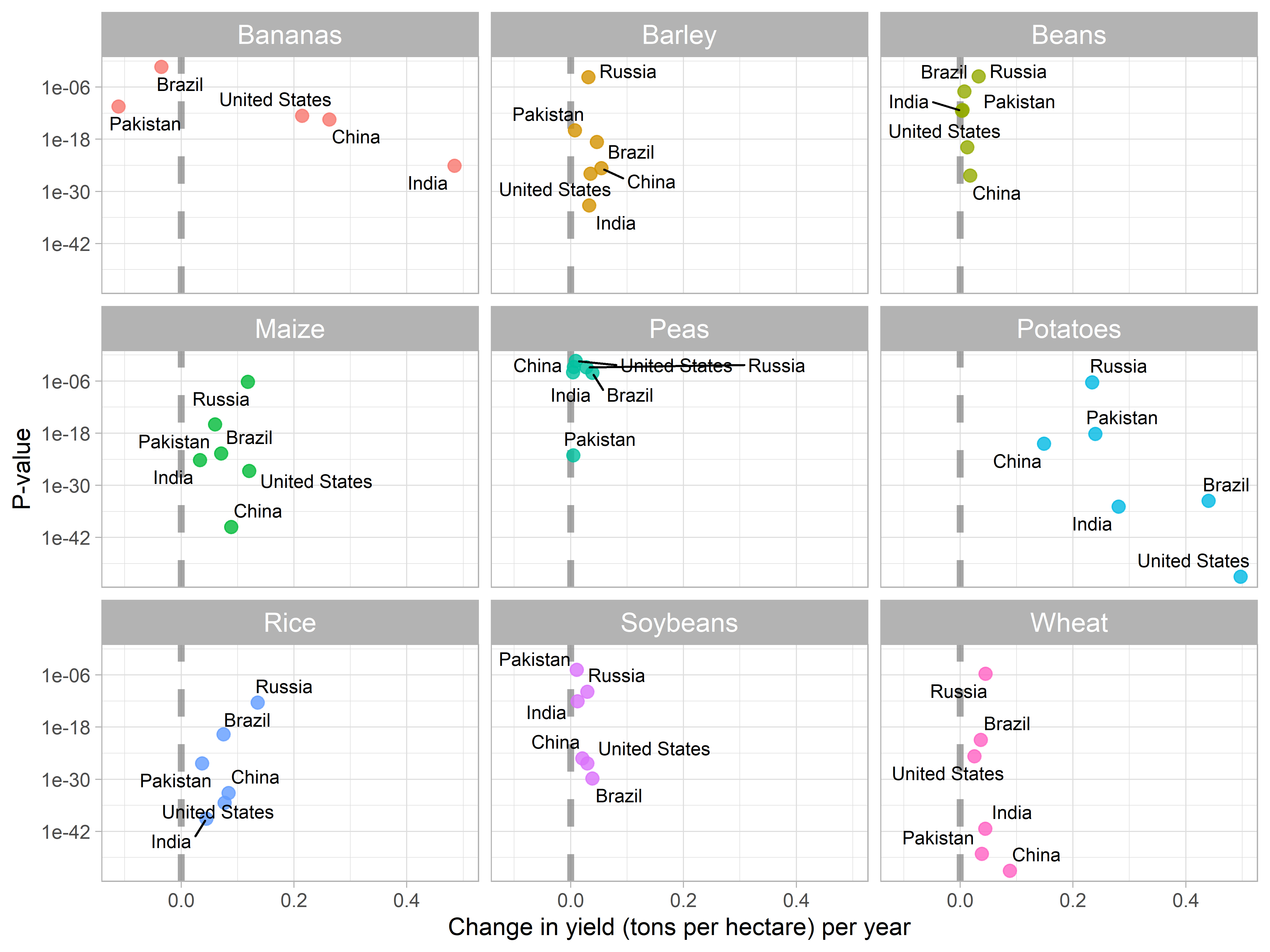
- The vertical line indicates
slope = 0no change in per hectare crop yield. - Countries on the right side of the dashed line have demonstrated improvement in per hectare yield over time.
- While, countries on the left side have demonstrated decrease in yield over time.
That’s all for this blog post. I hope you have enjoyed reading it and might get to know some new functions and R packages. You can use this code freely to clean, visualize and analyze your data. If you got any questions, leave those in comments and I’ll be happy to reply.